EA shows off the future of Sports FC, which is triangles apparently
The beautiful three sided shape.
.jpg?width=70&height=70&fit=crop&quality=60&format=png&auto=webp)
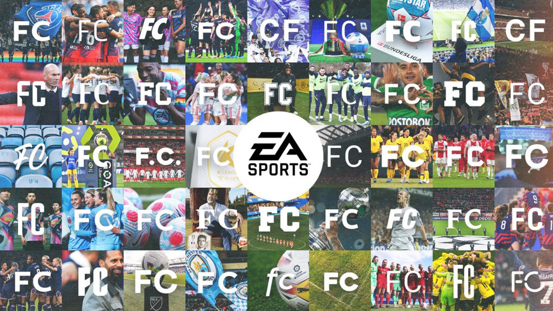
EA has shown off the future of FIFA, or EA Sports FC as it is now called, with a first look at the rebranded logo.
Last year, EA announced that it planned to split off from the football organisation FIFA, putting an end to the pair's almost 30-year run of games. Now, EA has given us a small look, specifically of the new logo, which is literally just the EA Sports logo, and the letters F and C made to look like a triangle. A bit minimalist, but it's a big win for triangle fans at the very least.
In a press release from EA, the developer and publisher shared that "FC will become EA SPORTS platform to create, innovate and grow new football experiences, connecting hundreds of millions of fans through console, mobile, online and esports products."
The press release also shares that "over the coming days, the EA SPORTS FC brand will debut in more than 100 matches across the biggest leagues in the world. Football fans will see the new brand identity in the wild for the first time through EA SPORTS partners, including the Premier League, La Liga, Bundesliga, Serie A, Ligue 1, WSL, NWSL, CONMEBOL and more."
If you're interested in diving deeper into the ethos behind the design rebrand, there's actually a whole post up on Medium explaining the thought process that went into making it. The beautiful game, as it's called, was a big inspiration behind the new look, with the triangle apparently representing the "sport in multiple dimensions." Now I'm not a football fan, but personally I mostly think of circles, but I'm not a designer either so what do I know?
More is set to be revealed this July, but really it will just be the FIFA everyone knows and some people love, albeit under a new name and a slightly different look.