Here's how Diablo 3 looked before it became all colourful

Diablo 3 looked a lot more like a sequel to Diablo 2 early in development.
The original Diablo games (1&2) are very grim, Gothic affairs. Their visuals reflected that, with darker colours and muted tones. When Blizzard initially unveiled the more colourful Diablo 3, there was a riot.
That negative reception to the change in art style eventually waned, but never completely died down. So much so, in fact, Blizzard made such a big deal about returning to that classic style when it revealed Diablo 4, in the hopes it'll attract longtime fans who didn't like the change in direction. But Diablo 3 didn't always look the way it does now.
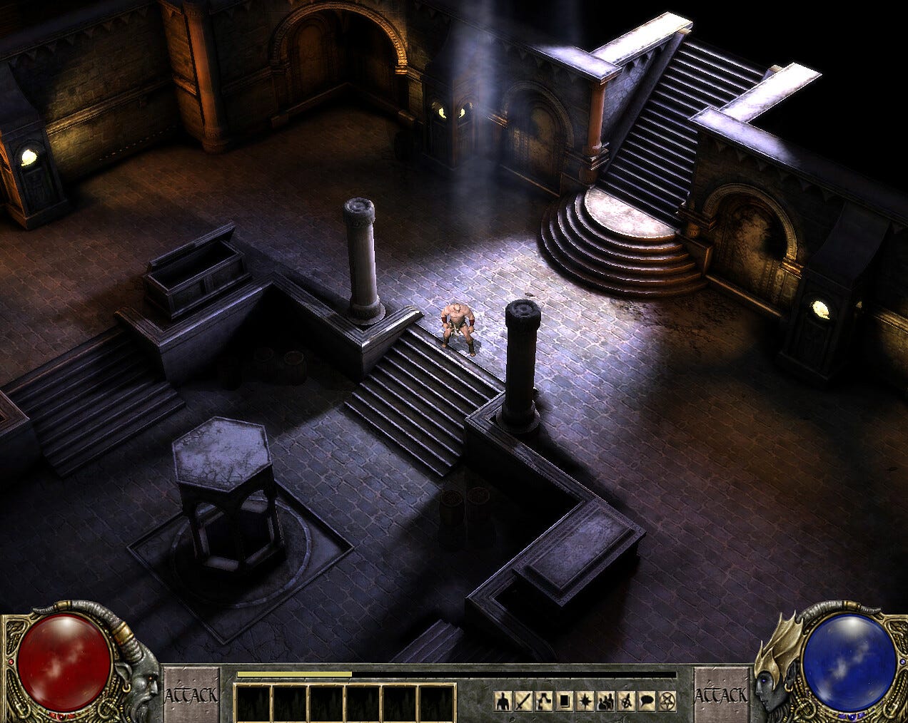
Oscar Cuesta, former artist at the now-defunct Blizzard North, recently shared a number of early pieces of environment art created for the Diablo 3 his former studio was working circa 2005, before it was shuttered. Cuesta actually posted the screens nearly a year ago on their Artstation page, but Diablo fansite Pure Diablo only just noticed them.
"At the time, models were pretty low polygon and we were only using base color maps," Cuesta wrote.
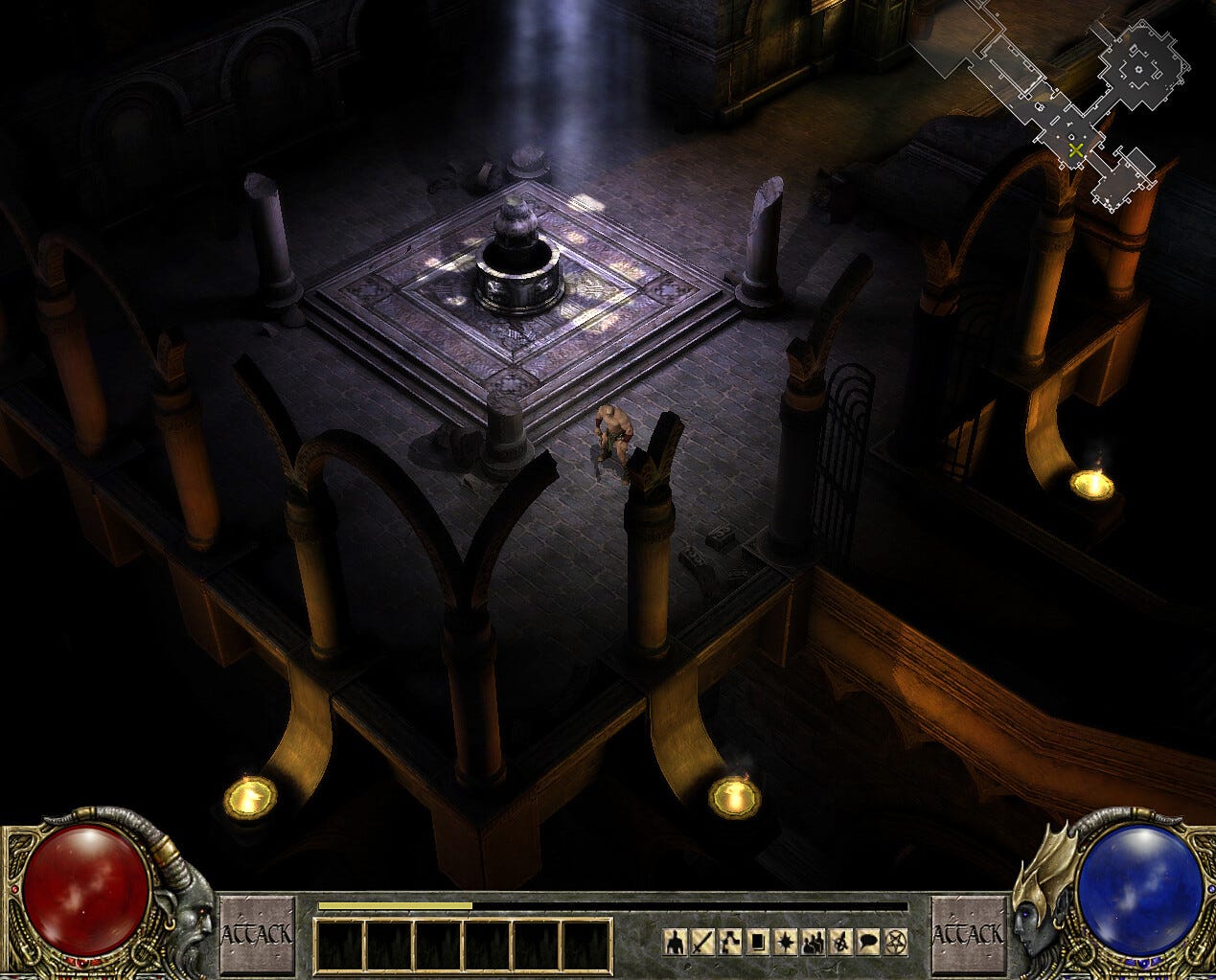
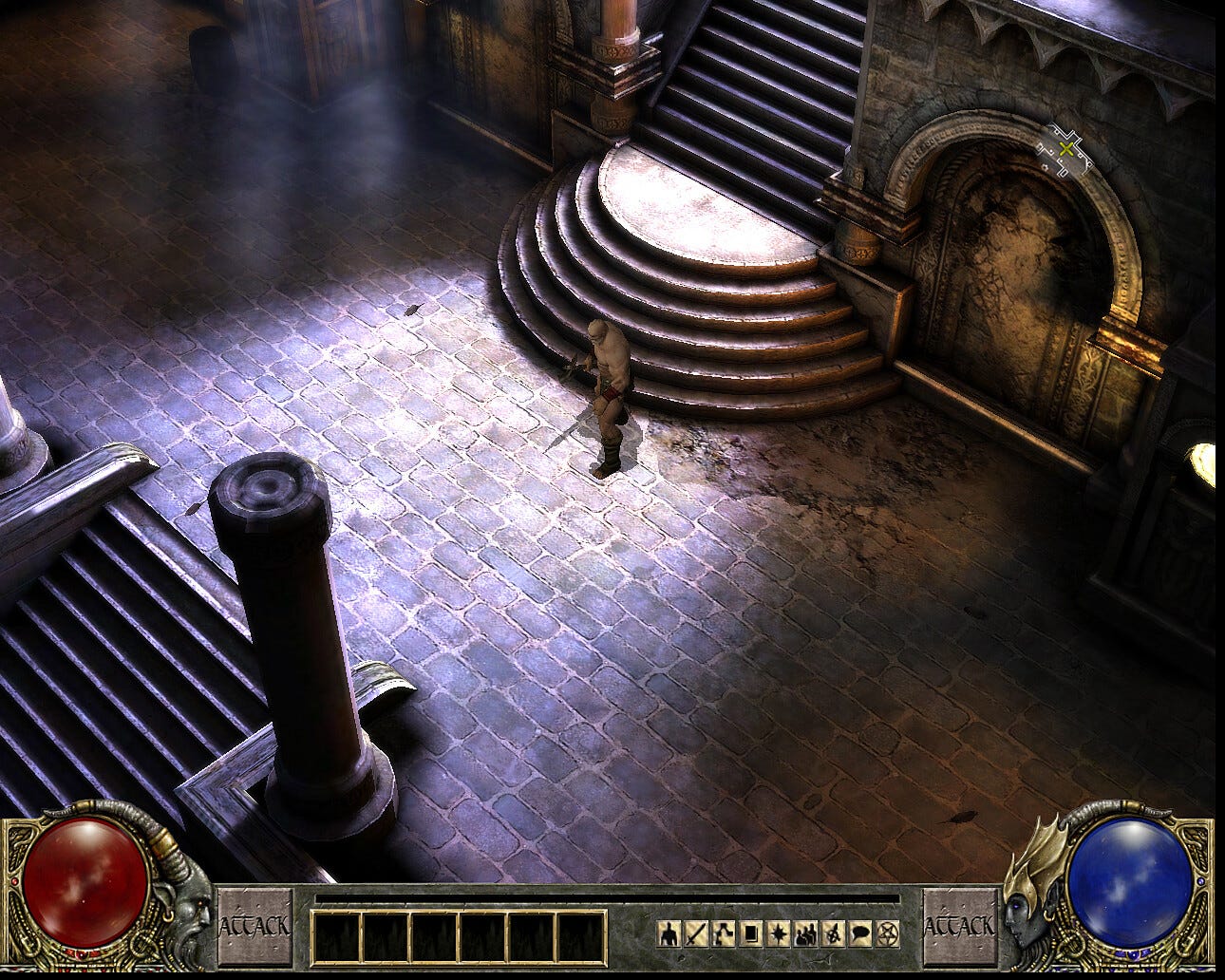
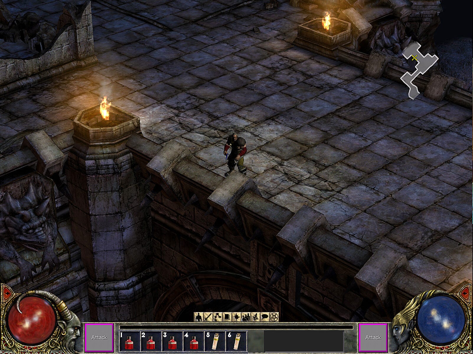
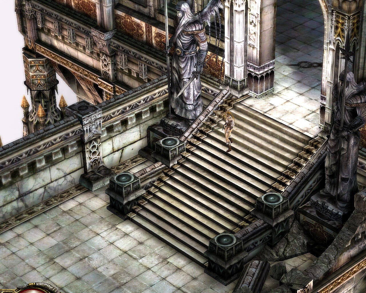
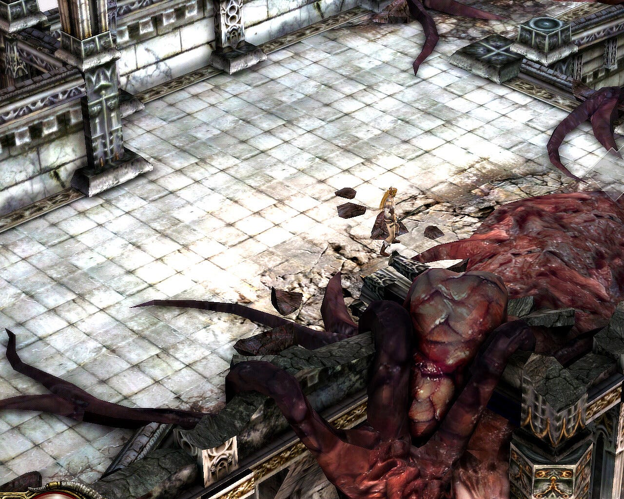
As you can see, this is a much more believable sequel to Diablo 2 than what we ended up with, though the actual Diablo 3 looks good in its own right.
Thanks, PC Gamer.