Tony Hawk's Pro Skater 5 changes art style, somehow manages to look worse

Published on
When your game already has a reputation of looking dated, perhaps it's time to market its other qualities.
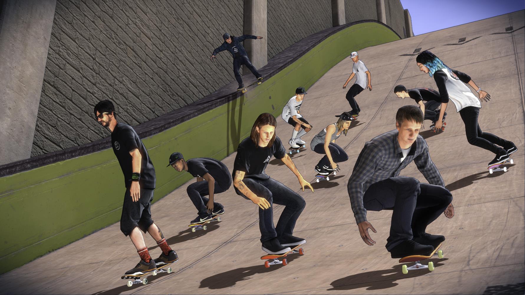
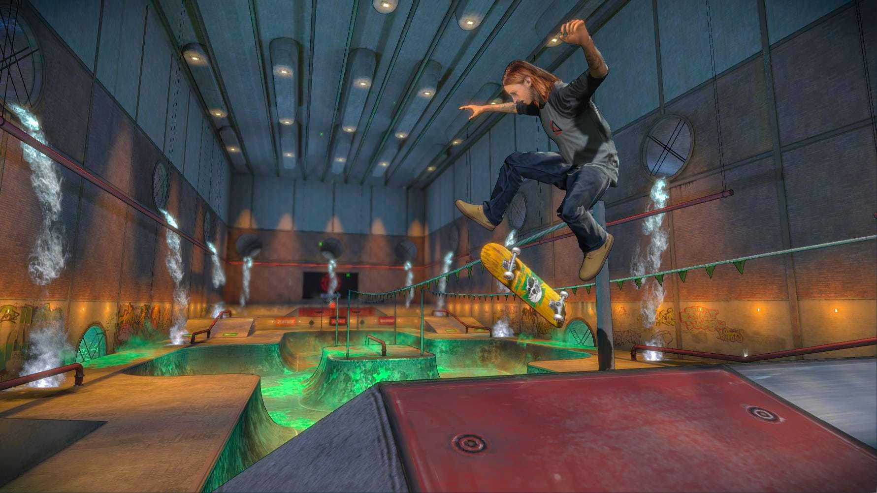
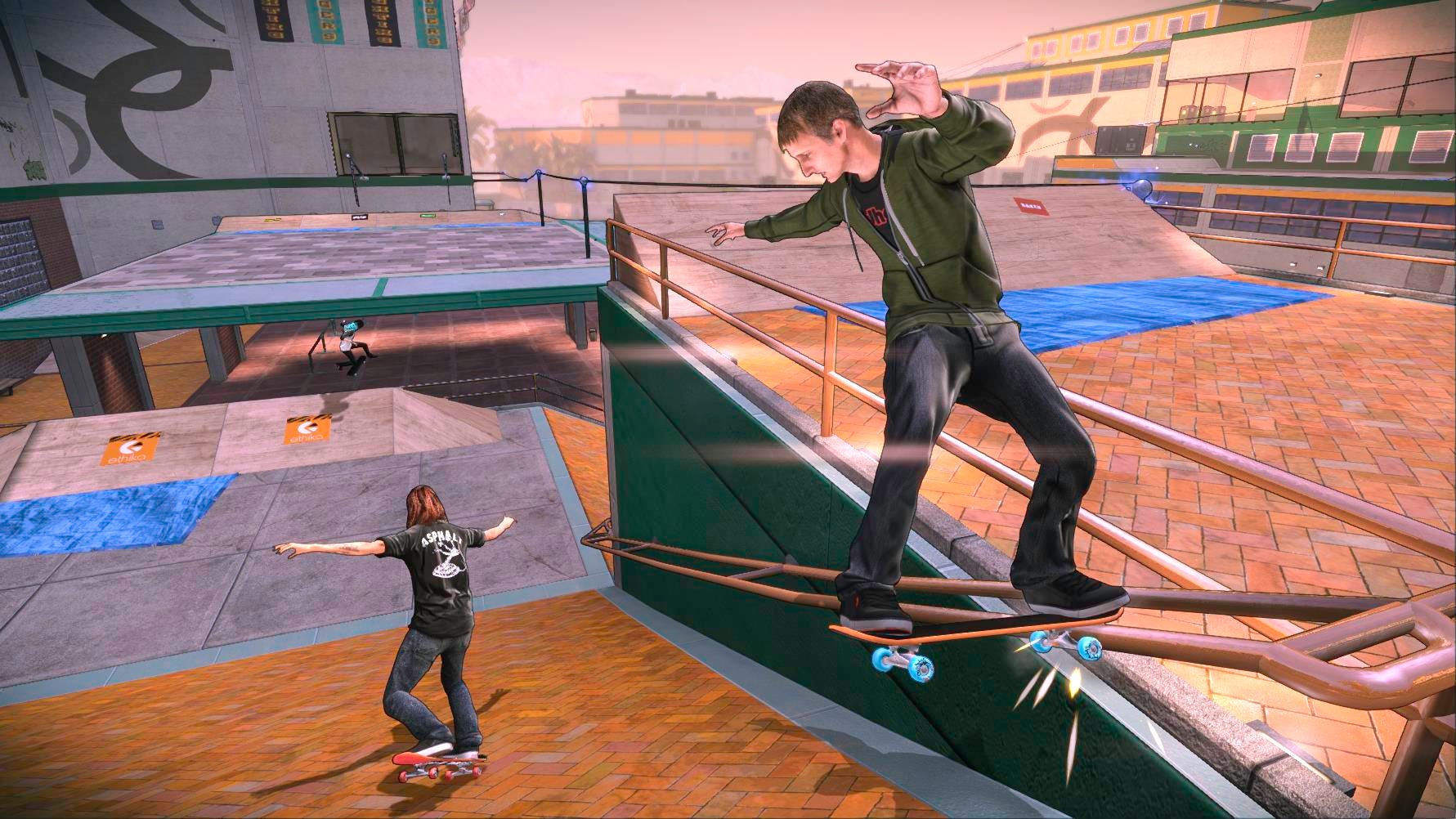
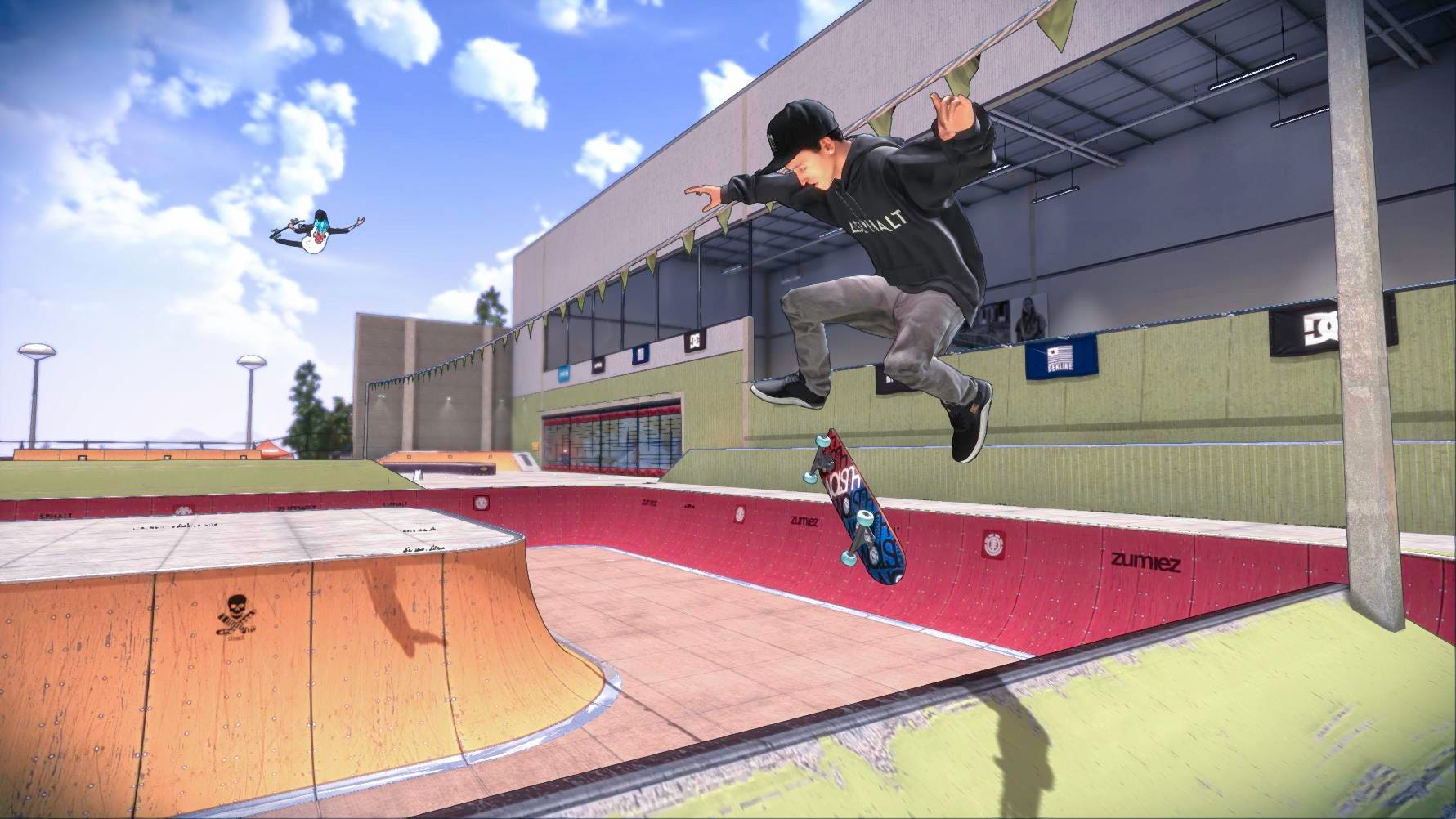
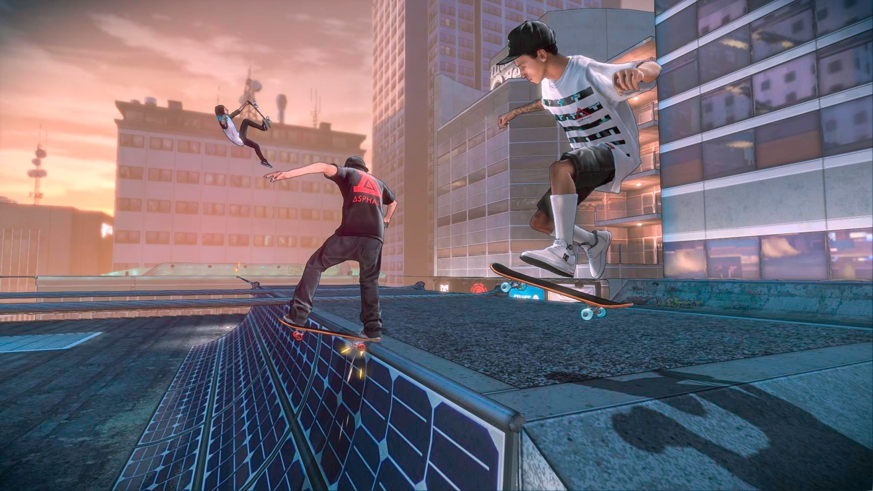
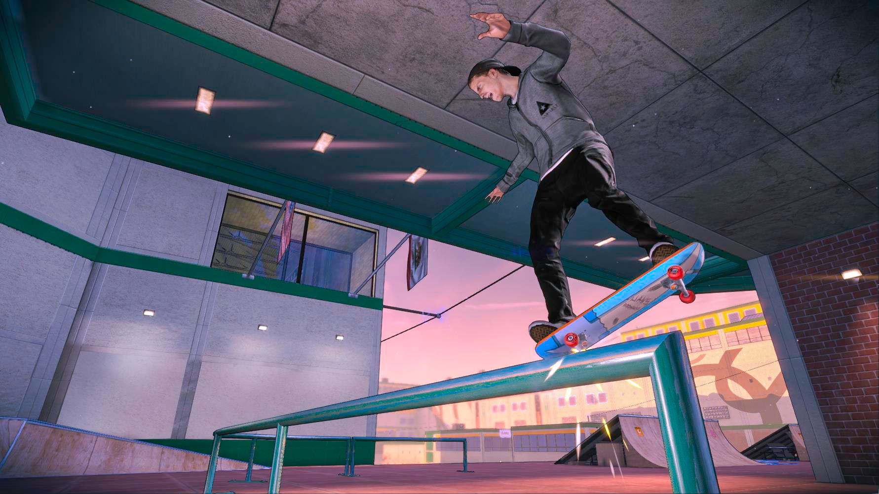
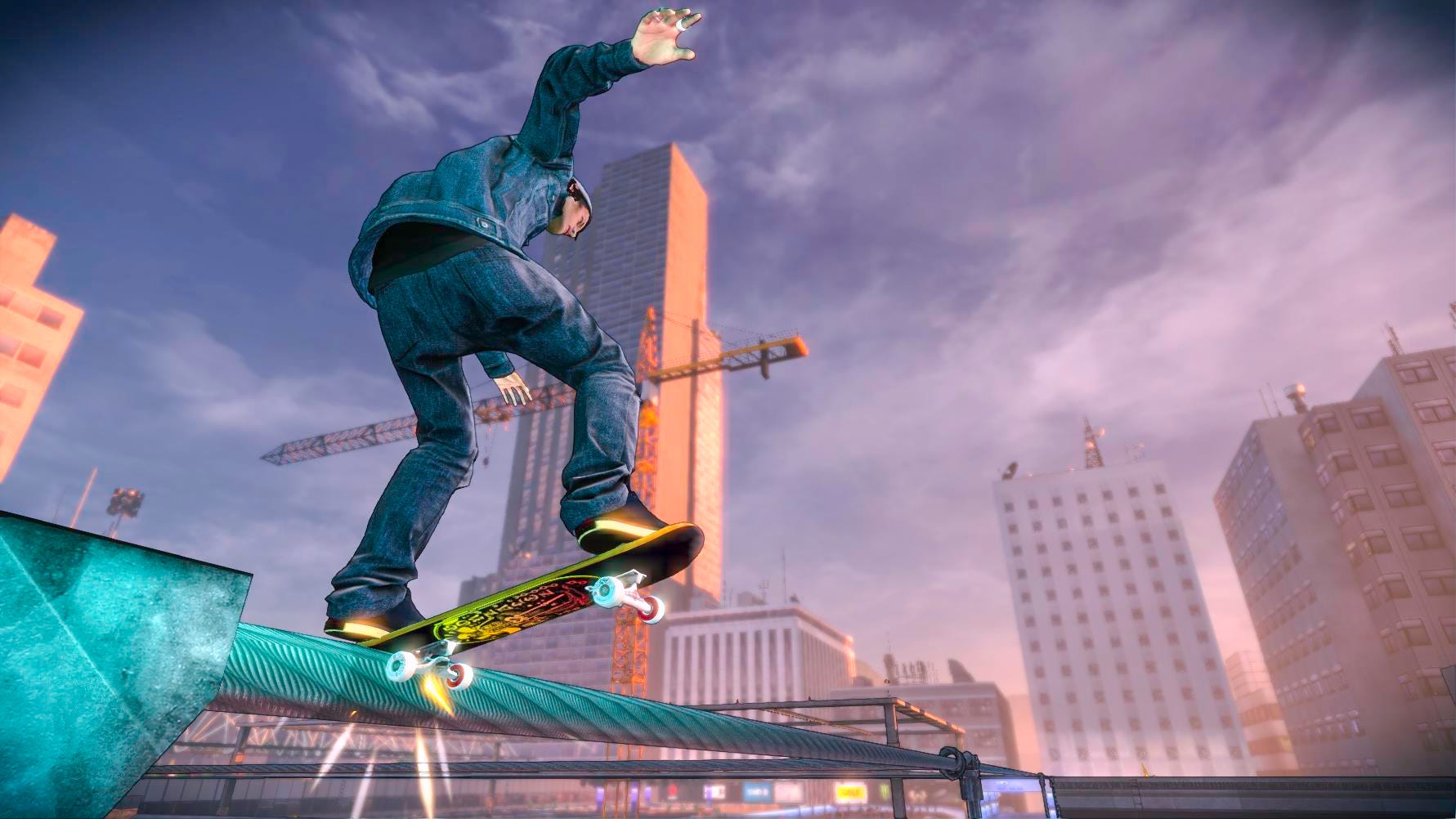
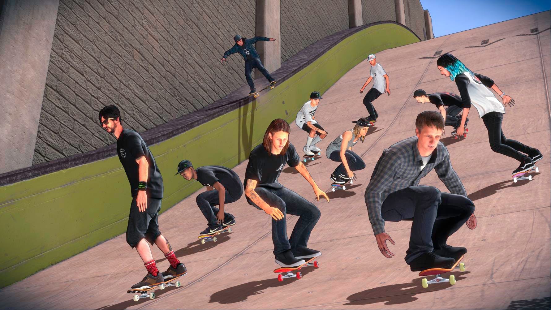
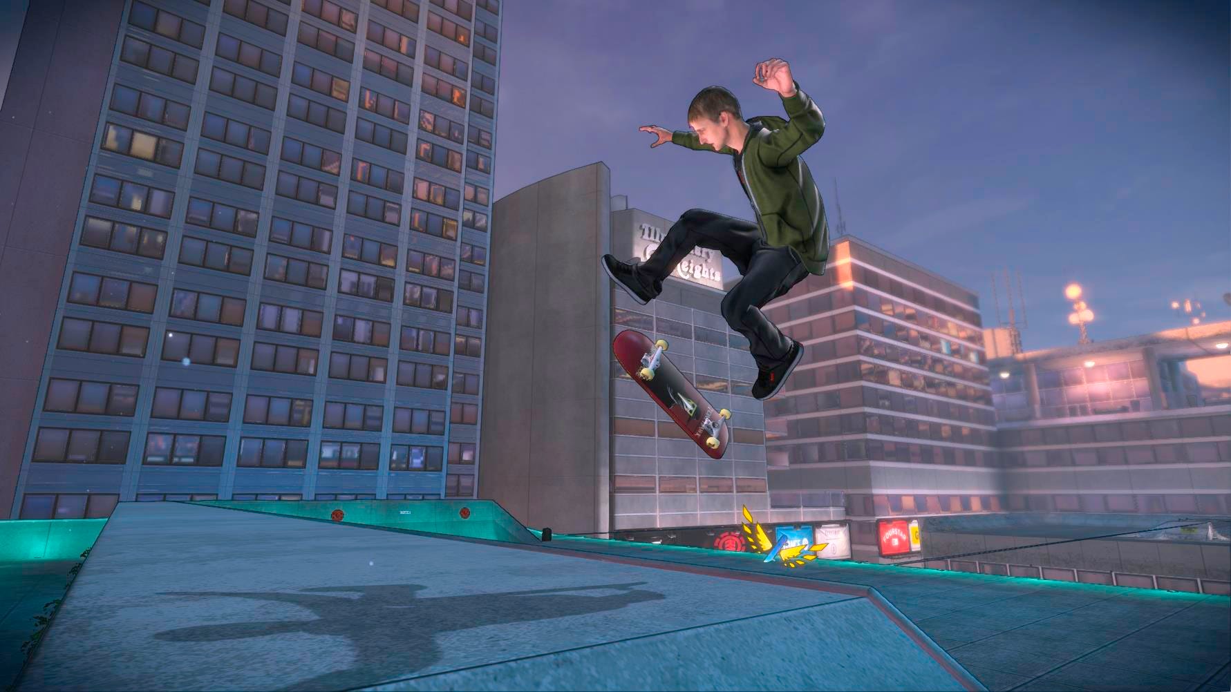
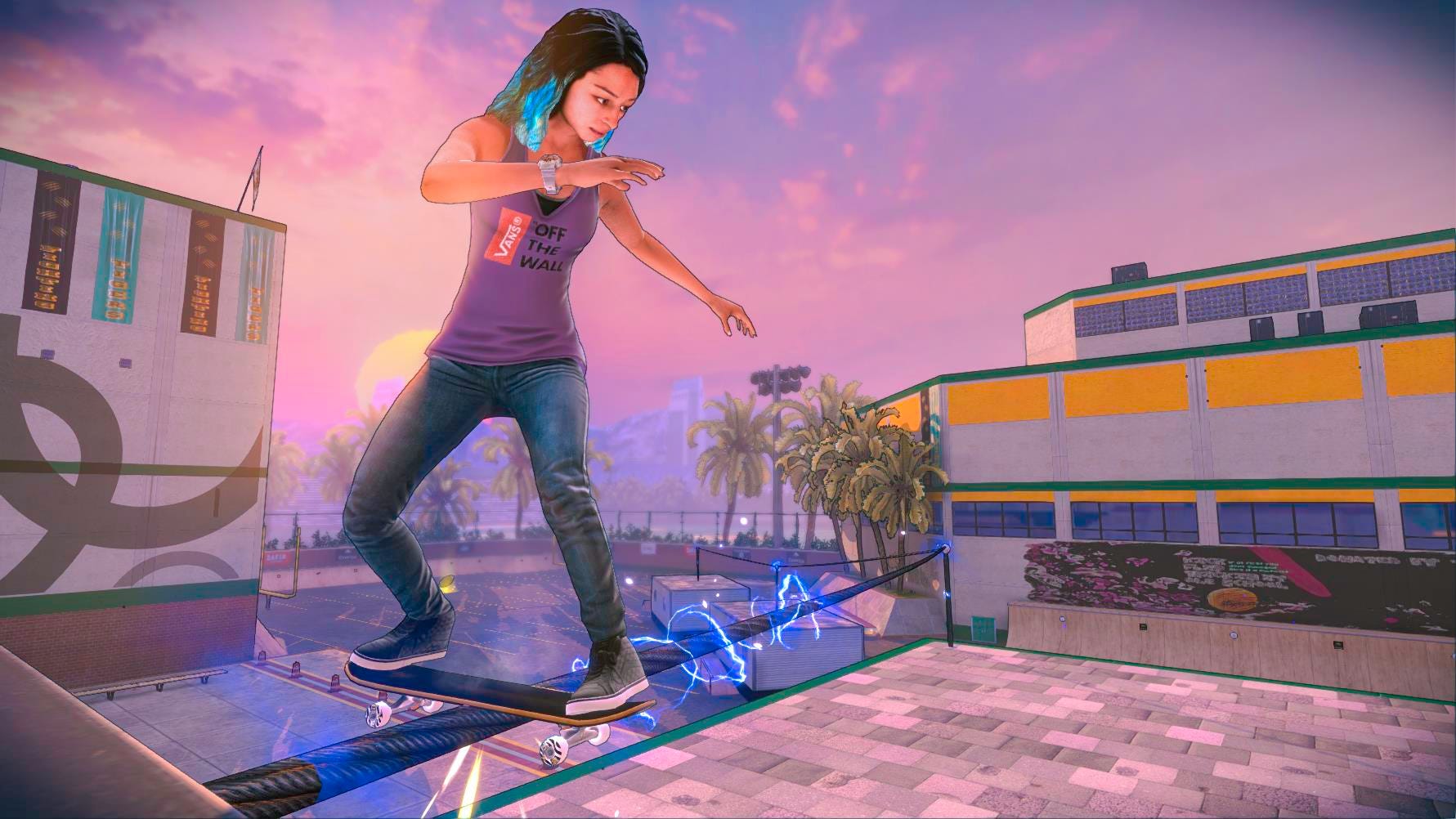
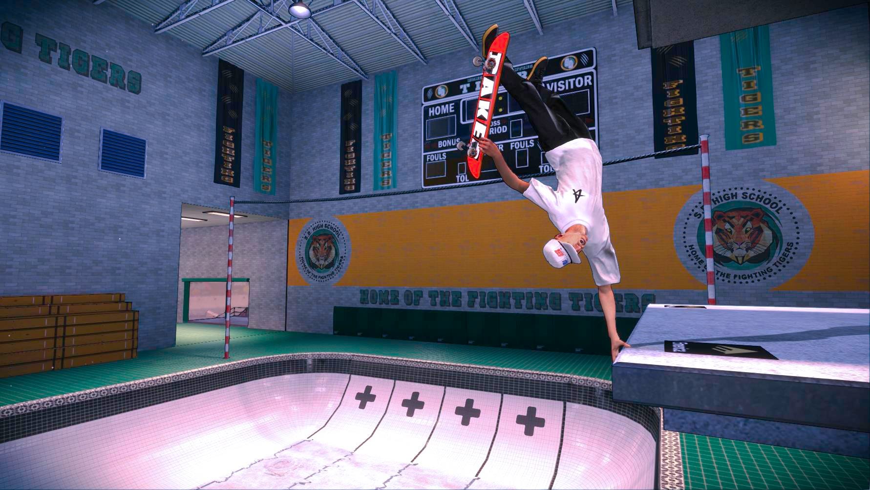
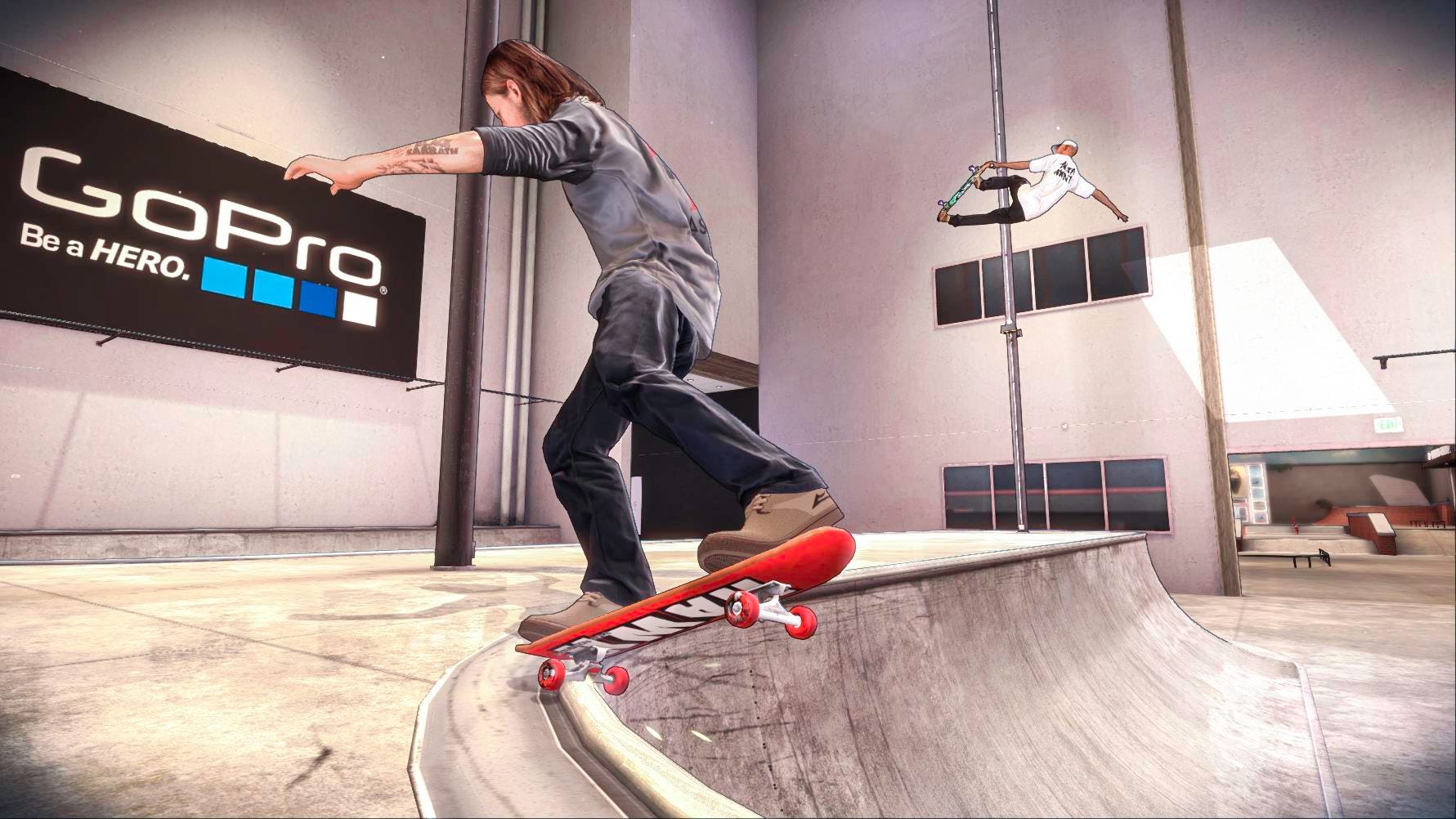
Tony Hawk's Pro Skater 5 developer Robomodo has seemingly changed the game's art style to be more cel-shaded. The game, which didn't look great to begin with, is somehow looking even worse now, thanks to these black outlines
Art style changes are not very common in the industry. When they do happen, it's usually for a game that's undergoing other major design changes. In Pro Skater 5's case, the game is less than two months away from its September 29 launch.
Some of the screens below make skaters look like they're cardboard cutouts.
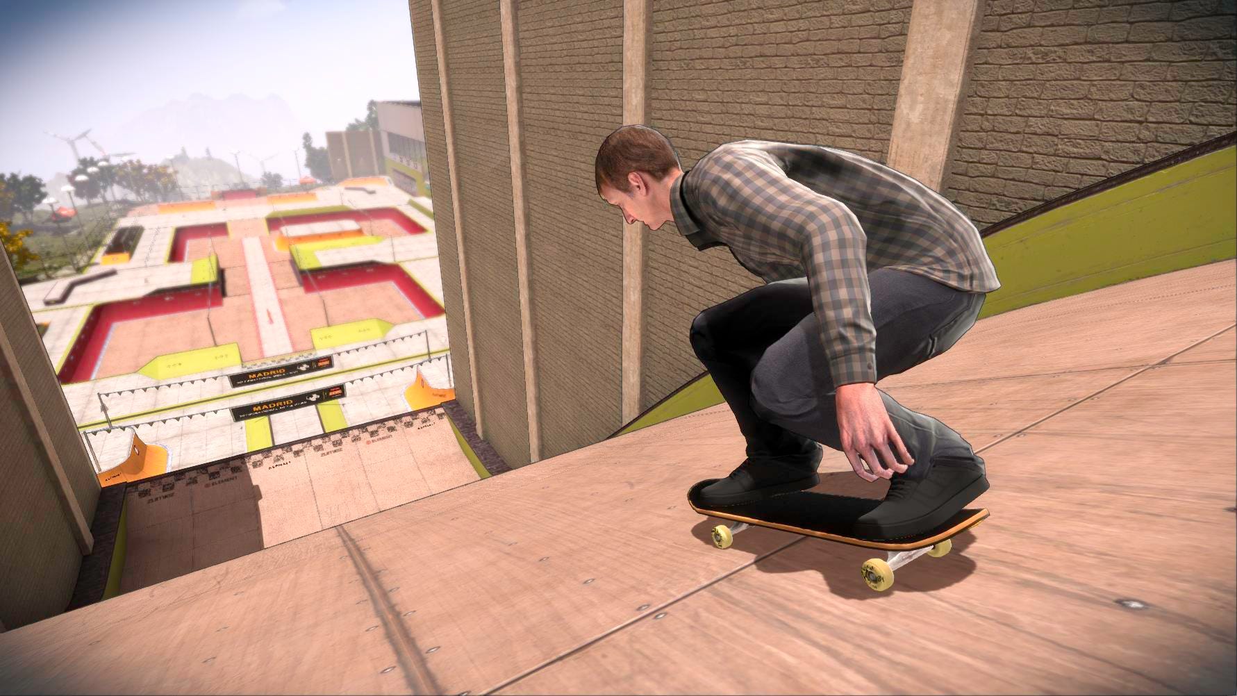
Find all the screens below and judge for yourself.
Thanks, The Ride Channel.