USgamer Community Question: What's the Coolest-Looking Games Console Ever?
It mightn't necessarily be your favorite console of all time - it's the one that you think has the greatest-looking case.
This article first appeared on USgamer, a partner publication of VG247. Some content, such as this article, has been migrated to VG247 for posterity after USgamer's closure - but it has not been edited or further vetted by the VG247 team.
This week's community question is all a matter of taste. More specifically, your taste in console case design. We're not interested in hearing which is your favorite console, or which one you think is the most powerful. What we want to know is - which one do you think looks the coolest?
It could be something really obscure, or a very popular system - but whatever it is, in your eyes, it's the best-looking system ever made.
Here's the USgamer team with their top design picks—and an eclectic selection it is too.
Jeremy Parish, Editor-in-Chief
Oh no… you used that word. "Cool." I'm no good with cool.
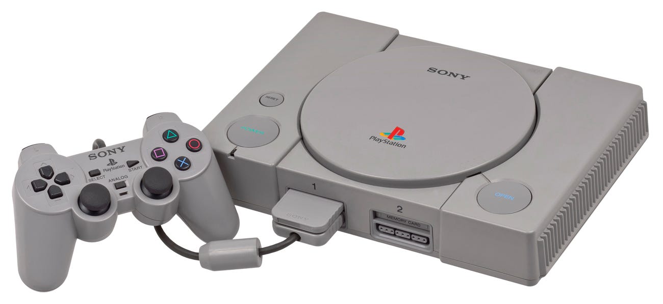
I can tell you which console's design I love most, though: Sony's original PlayStation. Not just from a visual perspective—though that's great, too!—but from an overall sense of its density, heft, and mechanisms.
PlayStation really stood out at the time of its debut. Its direct competitors—Nintendo 64 and Sega Saturn—skewed too far in one aesthetic direction or the other. N64 looked like it was trying a little too hard to mimic the lines of some supercharged automobile, with that weird hump at the front of the machine; Saturn, on the other hand, managed to be a glimpse of the future, but not in a good way: It was a safe, boring, black box like every console today.
PlayStation, on the other hand, demonstrated Sony's distinct flair for visual design, walking a careful line between style and utility. Its low-profile design made it feel wonderfully compact, while the deliberate use of circles didn't simply announce its reliance on sophisticated CD-ROM tech but also broke up the boxy linearity while creating a visually enticing asymmetry by placing a tiny Reset button next to the Power switch, which sat opposite the Eject button. Meanwhile, the controller and memory card sockets sat directly one on top of the other, with the controller plug designed to pair perfectly with a memory card when inserted, further enhancing the compact, low-profile look of the machine.
The PlayStation was also remarkably small, and when you lifted it, the thing felt dense. Not uncomfortably so, but it really communicated the fact that Sony had crammed a lot into that little box. The density added to the sense of quality (especially compared to the feather-light N64, whose emptiness made it feel like something of a toy), and the slow, controlled ascent of the CD lid only built on that impression. A pity that certain key internal components didn't reflect that level of quality in practice—my old PlayStation works, technically, but the CD drive has long since broken down and requires the console to be placed in any number of ridiculous orientations to read discs correctly.
Flimsy drive aside, the PlayStation was a bold beginning for Sony… all the more impressive considering it was cast in boring ’90s putty-grey. A pity they've never matched the aesthetic quality of their first console since; the PS2 looked retro-'80s (and not in a good way), the PS4 is a boring slab, and the PS3 was an atrocity of industrial design. Here's wishing the best for PS5!

Bob Mackey, Senior Writer
Instead of "coolest," my pick should probably be called "charming"—because it's kind of adorably dorky. (And I flat-out refuse to use the word "adorkable".) The Super Famicom has always stood out to me as an interesting console design, especially when compared to its boxy American version, which cut down on the colors and general sleekness of the Japanese system. It's not that different, mind you, but the Super Famicom is essentially a Super Nintendo with all of its harsh edges sanded down—and that applies to the carts, as well. What really makes this console special to me, though, is a small-but-nonetheless striking detail: the bold, four-color logo that really jumps out amid the general greyness of everything. The Super Nintendo's more muted color choice wasn't exactly ugly or anything, but there's just something intrinsically appealing about those candy-colored buttons. I guess what I'm saying is I want my game consoles to look like I could potentially eat them.

Jaz Rignall, Editor-at-Large
I'm actually a fan of the PS4 and Xbox One: both those systems are really neat, sleek-looking and fit into my entertainment system without looking the least bit out of place. But are they really "cool"? They certainly look futuristic, but I think I have to ultimately answer in the negative. They're just nicely-designed slabs of technology.
For something that's really "cool", I think I have to go back to the very late 80's to an obscure video game console called the Supergrafx. The system was based on the Japanese version of the Turbografx-16, the PC Engine, and was supposedly going to replace it - it had four times the RAM of the original machine and some additional custom chips that gave it marginally better graphical performance. However, while it was backwards-compatible with all PC Engine games, only a handful of titles were made specifically for the system, and it was ultimately a complete commercial failure.
However, while it didn't sell, I still think it's one of the coolest-looking systems ever designed. It's just so unusual. Sure, its faux-rivets look a little cheesy, but look at it. How outrageous is that design? It looks like a heavy duty piece of hardware from a sci-fi movie.
While it looks like it weighs a ton, it's actually surprisingly light. It really doesn't contain much in the way of hardware, and most of the space inside is taken up by fresh air - I guess that makes it a triumph of style over substance. Still, I really like it, and while I'm a big fan of the Mega Drive, which to me runs a close second to the Supergrafx, I just have to go with NEC's slab of retro-insanity for being a seriously cool bit of kit.
Kat Bailey, Senior Editor
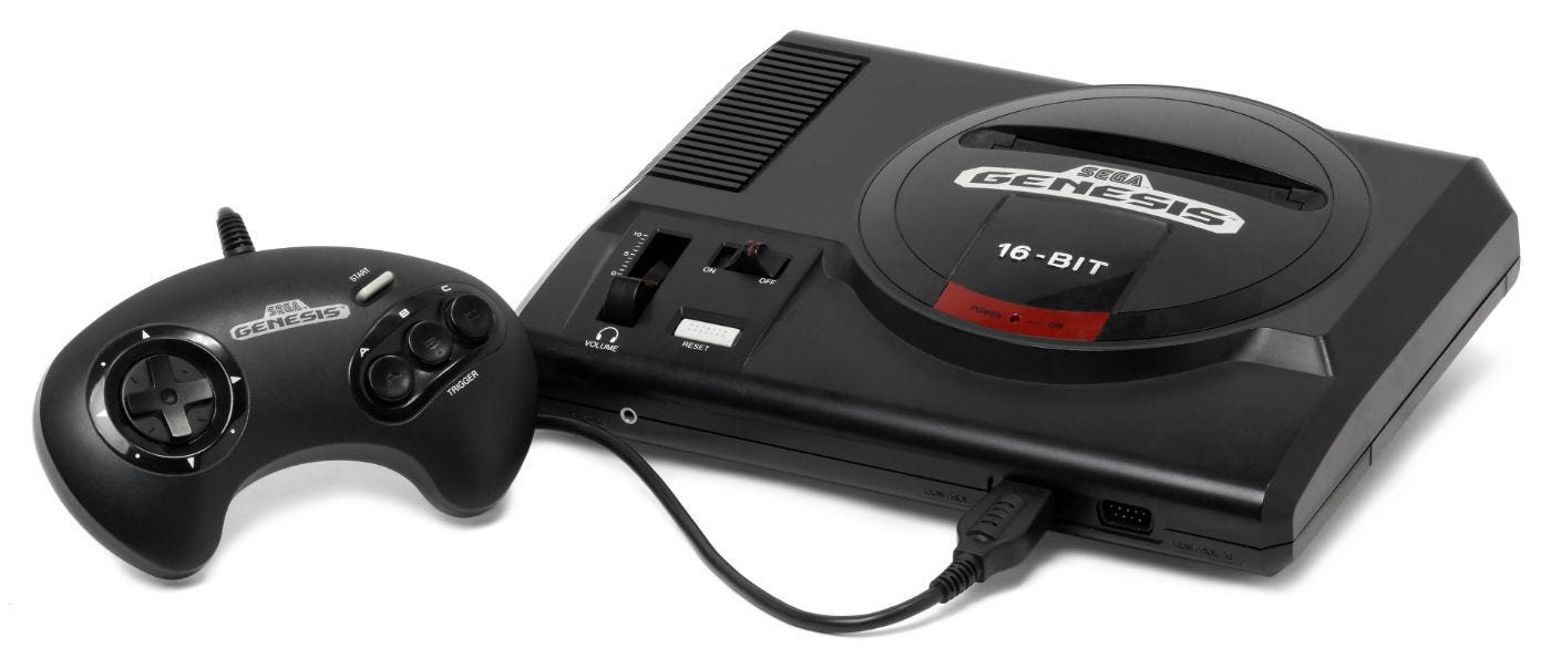
I'm going to go with the obvious answer and pick the Sega Genesis. The Slim PlayStation 2 and the second version of the Xbox 360 looked sleek and sophisticated, but the Sega Genesis was like a souped sports car - it just looked so cool.
Everything about it seemed calculated to stand out against the Super Nintendo. Its rounded edges contrasted against the Super Nintendo's boxy-looking corners. Its fierce-looking black was the opposite of the subdued greys favored by Nintendo. The rounded cartridge slot at the top looked like a supercharged engine. Everything about the Sega Genesis screamed, "This is what the older, cooler kids are playing," a look that was bolstered by a library that included the likes of Golden Axe, Altered Beast, and Mortal Kombat.
This, of course, was in an era when cool looking consoles really mattered. The Atari wanted to blend with '70s era furniture, and the NES wanted to be a VCR, but the Sega Genesis wanted to be known in absolute terms as the biggest, baddest video game console around. And in the pre-mobile era, it was more important to be cool than sleek and sophisticated.
A little more than a decade later, Microsoft attempted to replicate the cachet of the Sega Genesis by making the Xbox as big and angry-looking as possible. In some ways it worked, drawing positive comparisons to the GameCube, but bigger also wasn't necessarily better. There have been slicked consoles since the Genesis, but I don't think there's ever been one that's been cooler.