Nadia's Midboss Musings: Let's Celebrate Good NES Box Art for a Change
Sometimes this stuff was really, really cool.

This article first appeared on USgamer, a partner publication of VG247. Some content, such as this article, has been migrated to VG247 for posterity after USgamer's closure - but it has not been edited or further vetted by the VG247 team.
Video game box art and album cover art walk the same troubled path. Early releases on cartridge and vinyl were packaged in boxes and covers that doubled as a canvas. However, said artwork became more of an afterthought as CD jewel cases replaced cartridge boxes, and tapes and CDs replaced records. Now that games and music have largely gone digital, tangible cover art is rapidly becoming an endangered species in both mediums.
The decline of box / cover art is both a good and bad thing. Both are the visual summation of what an artist thinks the game or the album represents. A bad artist can ruin a good message, even if they're explicitly told what to draw.
But bad album covers are much rarer than bad video game box art. Even in the '80s and early '90s, the music industry had millions of dollars to spend on commissioning eye-catching album artwork. NES game publishers, on the other hand, usually had a few dollars in dimes and quarters they shook out of their kids' piggybanks.

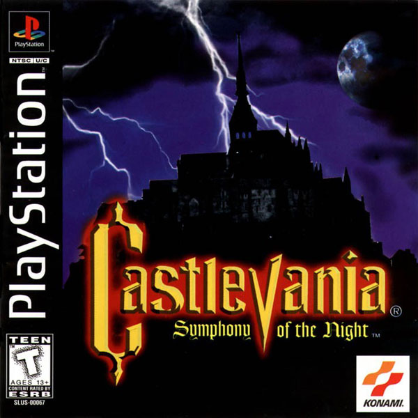
The state of video game cover art is much better now than it was 30, 20, or even ten years ago. Now even western publishers understand compelling cover art is a highly effective marketing tool (though it took some time; remember the horrid North American cover art for Castlevania: Symphony of the Night? Clip Art-O-Rama!). It was a long and difficult lesson, though, which is why I think it's important to celebrate good NES box art instead of just busting up Mega Man's box art yet again – not that it doesn't deserve to get dragged.
Here are ten examples of NES box art that I want to frame and hang on my wall next to the Picasso I don't have. Since this is a long and involved topic, I'm skipping the Featured Midboss of the Week this time around. Let's give them all a chance to regain some of their dignity (HA).

Double Dragon II: The Revenge (Image: Box Equals Art)
Let's start with an obvious one. Just look at that beautiful neon-drenched landscape. The Double Dragon games are supposed to take place in a post-apocalyptic universe, and I find it interesting that buildings and electricity have been restored, but people (women, mostly) still wear tattered clothing.
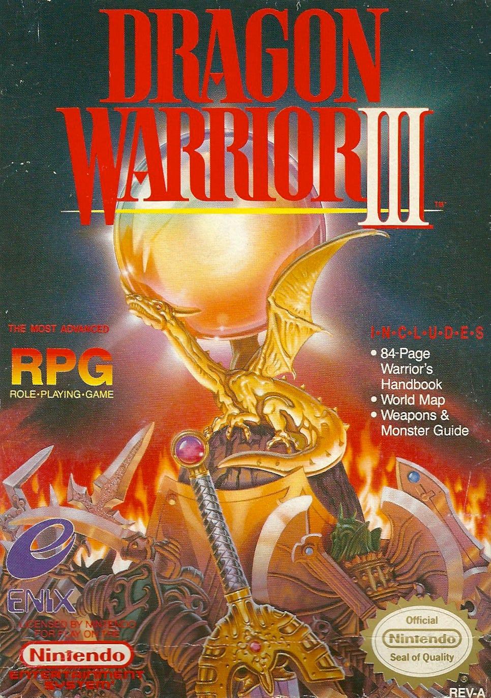
Dragon Warrior III (Image: Box vs Box)
Before Pokémon made anime highly marketable, it was common for western artists to re-draw Japanese box art. While the results were often terrifically generic (Dragon Power turned beloved anime icon Son Goku into a nondescript karate guy), the Dragon Warrior boxes made a real effort. Look at the cover for Dragon Warrior III. Not only does it look epic, but nearly every weapon and item is a western depiction of Akira Toriyama's original designs. You can even spot Loto's sword in the foreground.
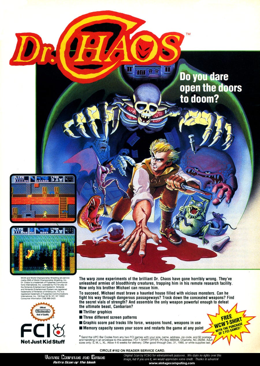
Dr Chaos (Image: Vintage Computing)
Dr Chaos is a weirdo game that tries to combine action, survival horror, and platforming with mixed results. The game itself is uglier than sin, but its box art is striking – and uncharacteristically gruesome for an NES title. Is this another rare instance of Nintendo falling asleep at the censorship machine?
High-res images of Dr Chaos' box art are hard to find, so I included an ad for the game, which utilizes the same artwork.

Hydlide (Image: Moby Games)
Hydlide is another FCI-published title, but unlike Dr Chaos, it's not an interesting experiment in game design: It just plain sucks. FCI spared no expense making the game seem cool, though. This dragon-and-knight duo appeared frequently on the backs of kids' magazines advertising the game, and I tried to draw them often. The dragon usually turned out OK, but the knight wound up looking like a Hobbit with neck problems.
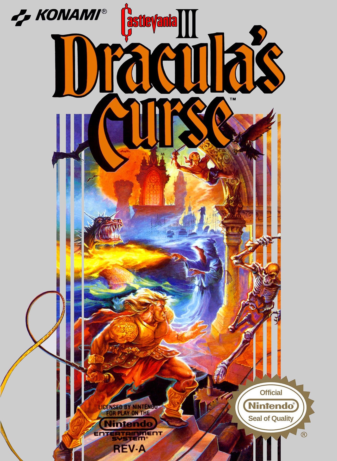
Castlevania III: Dracula's Curse (Image: Giant Bomb)
Konami's NES box art was consistently a cut above the competition's. It was always clean, clear, and attractive. Of course, Konami tended to copy dynamic action poses from movies and books, so it's no wonder its stuff is still awesome to look at. Achieve instant marketing success now! Ask me how!
I don't know if Castlevania III lifts any of its artwork from other sources, to be honest. It's just good. I still love how each character's power is portrayed correctly: Sypha is roasting a swamp dragon with her magic, Grant is shimmying up high to stab an owl, and Trevor is seconds away from spanking a skeleton with the Vampire Killer. Mwah.

King's Knight (Image: Giant Bomb)
Most of us forgot King's Knight existed until Square-Enix resurrected it in, bizarrely, Final Fantasy XV. The game itself is "meh" (King's Knight, not Final Fantasy XV, though I suppose it depends on whom you ask), but I appreciate seeing 80's anime NES box art from a time when it generally wasn't allowed to exist.

Double Dragon III: The Sacred Stones (Image: Giant Bomb)
The box art decorating Double Dragon III has a more classical feel than the comic book-style art adorning Double Dragon II's package, but that's not a bad thing. Real talk, Double Dragon's game logos rarely fail to depict the sheer awesomeness of the words "double" and "dragon" put together. You just take two dragons, see, and entwine them around each other and / or the logo. Voila. Instant tattoo material.
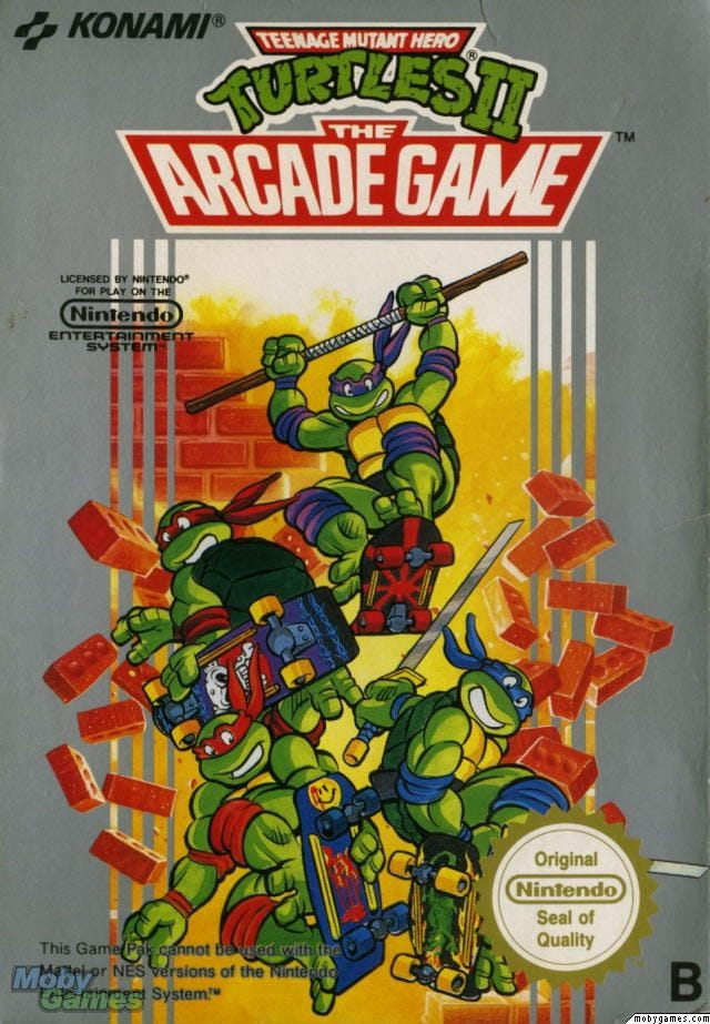
Teenage Mutant Ninja Turtles II: The Arcade Game (Image: Moby Games)
The toitles on the box for TMNT II aren't especially well-drawn, but I appreciate what Konami is trying to do here. The original Ninja Turtles for NES resembles the property in name only, and its comic-style cover art was unfamiliar to most young Turtles fans at the time. The second game, however, gave kids exactly what they wanted: A great beat-em-up featuring character designs pulled directly from the cartoon.

Ninja Gaiden II: The Dark Sword of Chaos (Image: Giant Bomb)
I'm pretty sure the New York skyline is ripped directly from a photograph, but everything else about Ninja Gaiden II's box art is wonderful. The looming dragon. The "Hard to Beat!" declaration (get gud, kids!). It's easy to assume Ryu is on top of the ocean because the artist was too lazy to paint in the ground, but if you look carefully, you can see Ryu is literally kneeling on the ocean like the cowl-wearing urban Jesus that he is. Applause.
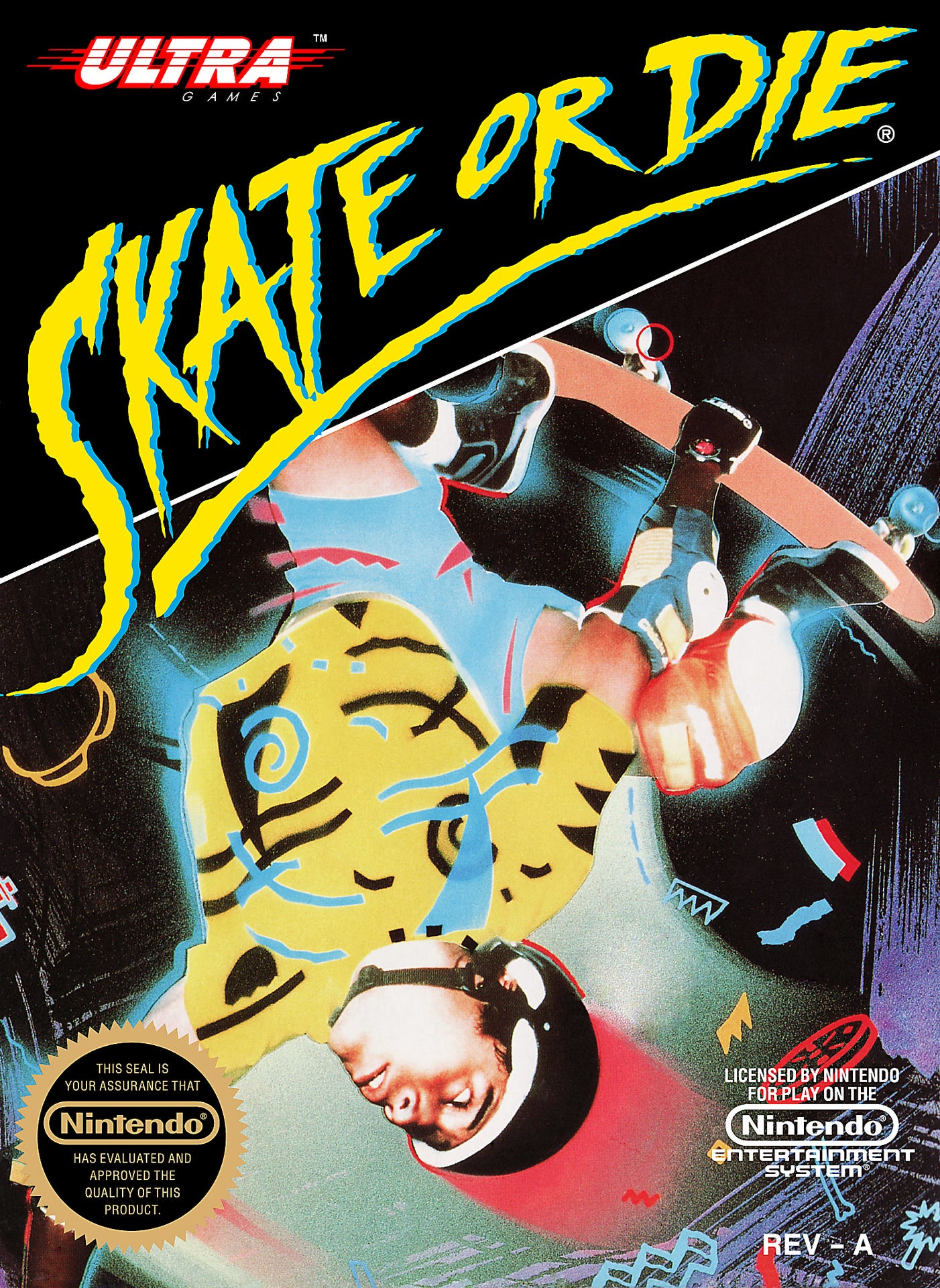
Skate or Die! (Image: Alpha Coders)
If some city out there packed a time capsule in 1988 and it doesn't include this box art as the quintessential representation of the era, then I can safely say future generations are being cheated.