An ode to diegetic interfaces and minimalist HUD design in video games

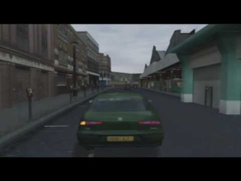
Did you ever play The Getaway on PlayStation 2?
Despite the Cockney gangster protagonist controlling like a fridge, it blew me away at the time. To my dumb teenage brain, it seemed so realistic. Of course it wasn’t - it just did stuff with its UI that I had never seen before.
One of the coolest things about The Getaway was how it stripped out the need for a minimap. This is a game set in a virtual recreation of London: a place where I need my phone to navigate in real life. Here you simply get in a car and the indicator lights show you the way - they flash when you need to turn, and the hazard lights blink to tell you when to stop.
So many modern open world games have these incredible environments full of detail, but you miss most of it because you’re constantly staring at a tiny circle in the corner of your screen.
When you’re in combat in The Getaway, there’s no ammo counter or any other screen furniture such as health and stamina bars. When you’re wounded, you limp. A blood patch appears on your back, and you heal by resting against a wall. Admittedly, the blood sucking back into your skin like you're Wolverine is a bit daft, but it’s still better than popping into a menu to eat loads of food you pulled out of a bin.
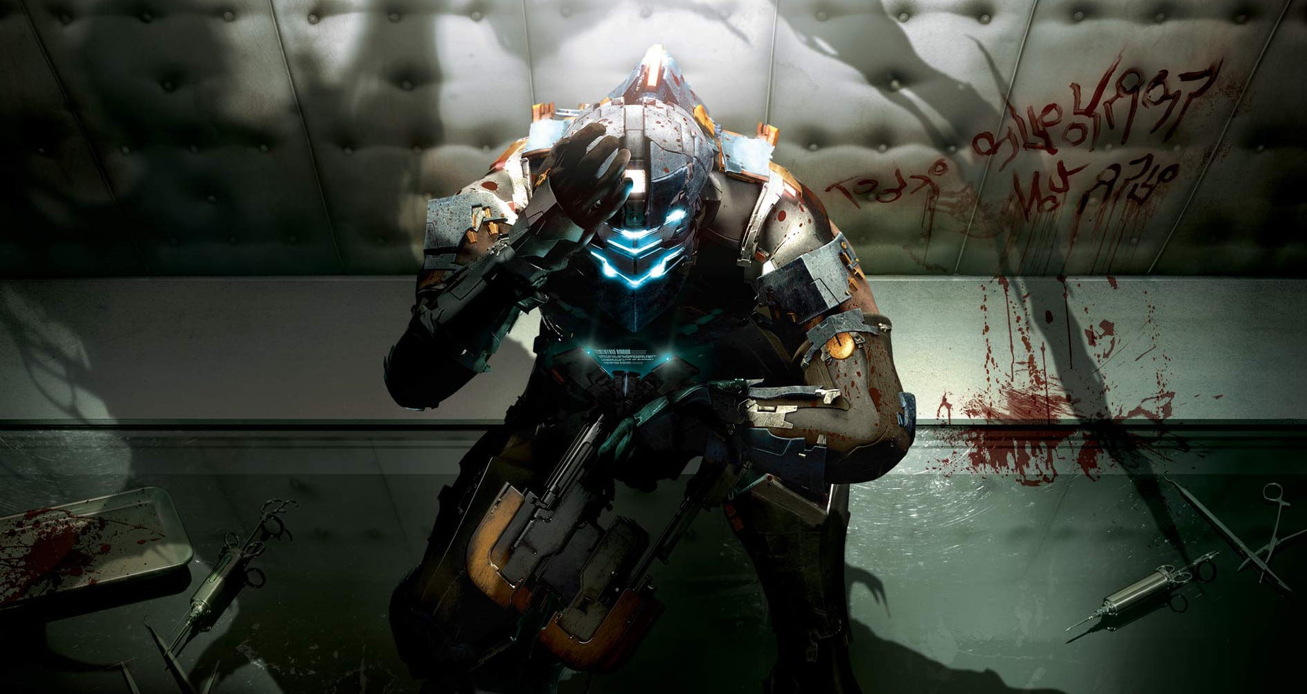
One of the reasons Dead Space is so great is because all of its diegetic UI. Need to know where to go? Tap a button and Isaac fires out a holographic image of your route. Your health reserves are displayed on a spinal column on the back of your suit, and logs play out from a holographic display on your wrist, while ammo counts are visible on each weapon. It all works together to pull you into the fiction - you see what the character sees and nothing more - and this heightens the tension.

The Metro series is another that proves that less is more. The simple act of cleaning mud and grime from your gask mask visor makes you feel like you embody the character, and even gamey elements such as a visibility indicator appear as gear components you can see at any time. If you play it on Ranger mode - the way the developer intended - you can’t even see your ammo count on the HUD by default.
One of the reasons I hate playing console and PC games that are ported to mobile is how ugly they are made - huge virtual analogue sticks and buttons take up a large portion of the screen space. It’s also why flight and space sims are the perfect fit for VR - those diegetic UI designs are part of your surroundings, they’re just a cockpit - and your real life seated position is in harmony with that, immersing you in the scene.

I wish more games - particularly open worlds - embraced diegetic interfaces. If your game’s big selling point is its world, show us the world - don’t have us navigate by following a minimap. Give us landmarks and have characters explain where we need to go so we can discover our destination for ourselves. If you must have a map, let us open it up to check it, but force us to engage with the world when we put it away.
The new Resident Evil 2 Remake is a good halfway point here. While it’s not an open world game, you need to master your surroundings to survive. You can open up a top-down map whenever you like, but when you’re in control all the screen furniture melts away. It’s not exactly diegetic, but a dynamic HUD is almost as good.
Do you have any strong feelings about UI design in games? Let us know in the comments.