Square Enix, please stop using terrible fonts in classic game remasters. I’m begging you
What is it with Square Enix and messing up the most simple elements of remasters of its classic game catalog?
After a laughably weak-handed E3 reveal of the Final Fantasy 1-6 Pixel Remasters, yesterday Square Enix unceremoniously dropped a bunch of new information on the hotly-anticipated rereleases. A steam page update revealed the release dates of the first three (this month!), teased that the latter three were ‘coming soon’, and revealed a bunch of full-screen, direct-feed images, finally giving fans a closer look at the games beyond doing ultra-nerd analysis on trailer freeze-frames.
And you know what? They look pretty damn good! While some fans will still undoubtedly be frustrated that there’s still no modern way to just play these classic games with the original art, the tweaked visuals for this version appear to nimbly dodge the danger of tossing out the baby with the bathwater with a remaster like this. Some changes are subtle, while others are clearly intended to add detail. There's a George Lucas-esque element of meddling and fixing that which wasn't broken here, but if the end result is good looking, it doesn't really matter.
Fans have been involved in arguments about why the changes have been made. Is it to match the original vision, away from the limited color palette constraints of NES and SNES hardware? Is it to emulate the look of the original sprites and art on a CRT display, as they would’ve appeared in the eighties and nineties? Is it a change for the sake of a change?
These are fun fan debates for us nerds, but really, they don’t really matter. The point is that the final product looks good, and appears to be going to a far greater degree of effort than the previous re-releases, which are imminently to be delisted from PC and mobile storefronts in favor of these new versions.
Even if you are mad at the sprites, one has to appreciate the effort here. The last release had ill-fitting redraws and backgrounds passed through some gross vaseline smear filter that didn’t even stitch together right, leaving unsightly seams between tiles. The point is, this is a HD remaster of these classic games that goes above and beyond what I would’ve expected. There’s clear love, care and attention to detail here. That makes the next question all the more pointed, however:
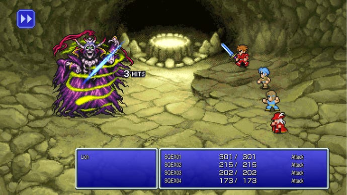
What the hell is that font?
Like, really. It’s bloody ugly, folks. And you might be thinking - it’s just a font, what’s the big deal? But these are text-driven games. Text is what you’ll be focused on 90% of the time, be that story-advancing dialogue, battle command options, or menu juggling of skills, gear and abilities. Almost every way in which you interact with Final Fantasy 1 through 6 involves reading their text boxes.
The condensed, drop-shadowed font is… well, it’s just unpleasant-looking. It’s not in keeping with the original releases. And honestly, it just puts me off these versions immediately.
I don’t think this has anything to do with pixel art fonts versus normal, modern fonts, either. While there’s a definite energy to the pixel art fonts, the Japanese release of the Pixel Remasters has a single modern font and looks better, with fonts that are designed around a constant, standard character width. This gives the font a balance that is easy on the eyes.
You can even see Latin characters that look better in the Japanese version, where those characters are used for the names of the party members. The Western version's typeface looks terrible. It's bad enough in battle, but open the menus - which of course are all text - and it looks like a cheap knock-off built in RPG Maker.
As well as simply being unsightly, it's been rightly pointed out to me that this highly condensed typeface also poses a potential accessibility problem for those with Dyslexia. The most readable fonts are meant to be of a certain size and sans serif, but also large letter and word spacing is said to be important. This typeface undoubtedly falls well short of those guidelines. Anyway, take a look - Japanese version on the top, Western beneath:
Font choice is an important part of localization. It’s something that drastically impacts the look and feel of the game - and that is even more true in golden age era Japanese RPGs, which are arguably the most text-driven genre other than adventure games and visual novels.
In this instance, it gives the FF Pixel Remasters the feel of cheap mobile ports, something fans of classic FF and Square Enix games will be acutely, painfully familiar with. It’s a shame that feeling is there again, because as mentioned the Pixel Remasters look like lavish and beautifully recreated versions of these wonderful games.
I understand why this can happen. The most likely cause I can see is the sheer scope of the localization of these titles. Six games, each with thousands of lines of text - dialogue, battle barks, move names, spoony bards, and all sorts else. There’s not just Japanese and English versions, but variations in ten other languages besides. To some extent, there must be a desire to keep the number of fonts as low as possible in order to minimize potential development issues. Perhaps they’ve even found one font they can use universally - but this isn’t an excuse.
This is an element of the game that deserves attention to detail and a discerning eye. If that means more than one typeface being used internationally, so be it.
The modern re-releases of Final Fantasy 8 and 9 suffered a similar fate. Back in 2019, I wrote that “the original release of FF9 had a rustic-looking font designed to match its setting [...] the re-release opts for a more sterile, basic typeface. The new font is worse.” Fans ultimately created ‘Alexandria’, a font emulating the original PS1 FF9 font, and injected it into the PC version of the game as a mod. The font in the Pixel Remaster makes the standard font in modern FF9 look like a typographical masterpiece, though.
I’m sure some of you think this is all an overreaction. It’s just a font! But, honestly - I think text is so vitally important to these games, and the fan reaction on social media suggests I’m not alone.
In the wake of the reveal brilliant YouTubing games wordsman Tim Rogers resurfaced an old tweet of his from 2018 where he asked Square Enix if they knew they could pay for a good font, jokingly offering to pay for one. That tweet was about Chrono Trigger’s modern port, which was a total disgrace and has since been largely fixed. Three years later and Square Enix apparently hasn’t learned the font lesson, though. Some of the past screw-ups like Chrono Trigger felt almost maliciously malignant and uncaring of the legacy of classic games - but with how much effort has clearly gone into other aspects of the Pixel Remaster collection, this font thing just feels careless.
Final Fantasy is known and adored for a great many things, but something the series is particularly loved for - especially in the 16-bit era - was its visual splendour. With beautiful character designs by Yoshitaka Amano, sprite work by the legendary Kazuko Shibuya, and enemy and background art from the likes of Hideo Minaba, Tetsuya Nomura, and Tetsuya Takahashi, the legacy of its visual art towers as high as those of its story or gameplay.
The text is a small part of that, but in these classic games it is in many ways the bridge between those visuals and the story, arguably the two most important stand-out elements.
That makes it utterly vital. It doesn’t matter how luxurious or impressive the rest of the remaster is - if this key connective tissue remains ugly, the quality of the whole package is significantly lowered as a result. Fonts matter. They are at the forefront of a game’s presentation, and are a cornerstone of a quality localization. Please, Square Enix, I’m begging you - stop using these terrible fonts in your modern ports.
