PlayerUnknown’s Battlegrounds: why the UI and HUD should absolutely stay the way they are

PlayerUnknown’s Battlegrounds doesn't need pretty, informative UI, because it's not that kind of game.
This week, PlayerUnknown’s Battlegrounds creative director Brendan 'Playerunknown' Greene took to the Steam forums to solicit feedback about a seemingly small change to the game’s UI. His question to the community was simple: do you want to be able to know at a glance the type and amount of consumables you have, or should getting this information continue to require bringing up the inventory screen?
To someone familiar with shooters but who has never played Battlegrounds it a) may seem insane that a feature this important isn’t already in the game, and b) that it’s even causing this much discussion. I am the type of player who's willing to dedicate a few hundred words to discussing something so deceivingly trivial, so let me explain why.
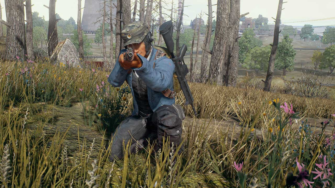
At its core, PlayerUnknown’s Battlegrounds is a game of risk and reward. You pick a populated area at the start and you risk getting demolished one minute into the round. Your loot will be plentiful, though, and you’ll get a bit better at shooting. You equip a sniper rifle in your second slot instead of a close-quarters weapon and you’re dead if someone sneaks up on you. The upshot is that you dominate at range.
You camp, avoid conflict, and you’re safe, with only the entryway into your hole to cover. Move too early or too late, though, and you’ll get shot in the back without enough time to react.
Ultimately, every action you do has the potential to leave you at a disadvantage, but the trick is to go with what you’re comfortable with first and try to minimise the drawbacks. This basic concept also applies to inventory management, a big part of playing PUBG.

"What the game does is introduce an element of skill to a simple action like picking up loot, creating a skill gap where none existed. The result of this is a wide variance between players - rookies who take minutes to loot while standing still, and pros who grab the essentials in seconds, never giving their enemy a shot."
Opening the inventory screen and dragging loot from the ground to your backpack is a tactic everyone uses, because it saves the time of having to pick up each item individually. By design, the inventory screen covers up your entire screen, dropping your visual awareness to near zero, and that’s not something you want.
When looting, good players will bring up the inventory and prioritise picking up what they actually need versus what other useful items the dead guy might have. So they open it, drag med kits and boosts, and back out – all while strafing back and forth ever so slightly to juke attackers.
When things die down, they move on to properly loot extras like attachments or even a different weapon. Anyone who has played Battlegrounds, or even watched a few minutes of it on Twitch, will know how incredibly tense it is to loot someone in an open field or really just stand still for a few seconds as you pick items up.
And that doesn't just go for looting bodies. Any time a player wants to know if they should take a boost now rather than later, it requires a click of the button and count of how many are available.
What the game ingeniously does is introduce an element of skill to a simple action like picking up loot, essentially creating a skill gap where none existed. The result of this is a wide variance between players. The rookies who take minutes to loot while standing still, and the pros who grab the essentials in seconds, never giving their enemy a shot.
Even when you discard the risk/reward philosophy, there are plenty of examples of similar mechanics in Battlegrounds that, upon removal, would no doubt make the game easier to pick up and more player-friendly.
All guns start on single fire, and they’re never loaded with ammo. Jumping out of cars at something like 5km/h gets you killed. There isn’t that much ammo unless you actively look for it. The inventory screen itself is basically just a big list you have to comb through anytime you want something.
These design choices and many others like them exist to force an element of tactical thinking into every move a player makes. It conditions the player to treat the game with care, not due to inconsistencies, but because it requires undivided attention every time.
Not everybody agrees with them, but they exist to serve a purpose. More importantly, it’s something you learn to adapt to. It’s only through overcoming this “clunkiness” will you truly start getting better.

This discussion reminded me of the difference in design goals between something like Call of Duty or Battlefield and games like Arma or Insurgency. All these games have in common is that they’re first-person shooters. At a really high level, they're all the same point-and-shoot simulators.
It's only when you start exploring the details that a divide floats to the surface. Something as banal as the act of reloading a gun, which you do incessantly in CoD or Battlefield, is perceived completely differently in a game like Insurgency. Reloading after firing two shots discards the rest of the magazine in the latter, whereas if this happened in the former, it would most certainly be reported as a bug.
"PUBG is a game where sniper rifles are kings of long range, where bullet drop and engagement distances are respected. If it doesn’t conform to modern standards of ease and accessibility, why shouldn’t it treat its UI design the same way?"
Suddenly, you’re counting the shots fired in your head and only reloading when you think you’re out. Battlegrounds doesn’t do this, of course, but it has more in common with games like Arma and Insurgency than it does with Call of Duty and Battlefield.
The developers created a game where recoil management matters here, to the point some people avoid certain weapons altogether because they’re hard to control. A game that leaves you unable to move anytime you want to consume a boost or use a med kit.
It’s a game where sniper rifles are kings of long range, where bullet drop and engagement distances are respected. All of this is to say it doesn’t conform to modern standards of ease and accessibility, why shouldn’t it treat its UI design the same way?

You could argue that obfuscating how many grenades or med kits you have behind a button press is tedious and doesn’t require skill. Or that it distracts from the fight when you’re trying to focus on movement and shooting, not fiddling around with inventory screens.
All valid points, and they would make complete sense in other games, but not in Battlegrounds. The perceived clunkiness of it all is not just endearing, it gives satisfaction to everything you do in a round, no matter how small.
Having HUD icons that tell you how many grenades and med kits you’re holding will open the door to a more fully-featured HUD that could potentially show armour damage and other bits of intel you would otherwise need to manually check.
This loss won’t destroy gameplay, but it’s going to take away one of the game’s unique features. Before a decision like this is made, the only question that needs to be asked is whether or not the gain is worth it.