New Xbox One Experience? Same old clutter
Xbox One's big changes aren't big enough.

"We move from the land of clutter to the land of slightly better-presented clutter. If the 360's New Xbox Experience was a triumphant re-invention, this is more like the same old thing with a lick of paint."
I've never been one for console wars, but everyone sees it from the sidelines. The huge reaction against the Xbox One at its announcement still reverberates through this generation's big battle, and dogs both the machine and the Xbox division as they try to re-position. The New Xbox One Experience rolled out on November 12 is one part of this, aiming to re-enthuse current owners by improving the function-packed but clumsy frontend – and perhaps interest a few casual onlookers, too.
The 'New Xbox One Experience' line is an echo from the 360 years, and the excellent refresh that Microsoft dropped in 2008, three years after launch – this changed the 360's original 'blades' UI, which had aged badly since launch, into a cleaner and brighter dashboard that incorporated Rare's avatars to good effect. This was the first time a home console had so radically changed the way it felt through downloading a new operating system: the fact it was so much better made your old hardware feel vital again, modernised. It was a great idea then and it's a great idea now.
Especially on Xbox One. There are only two things I love about the Xbox One's OS: the first is that the game you were last playing is the starting selection, so just pressing A gets you straight in. The second is that it says “Hi Rich!” which I find charming rather than oddly creepy. I've never been especially comfortable with the big adverts on the right-hand third of the homescreen – but that's my personal taste, and perhaps you're not so picky. So let's look at numbers instead.

On what is now the old Xbox One UI there were two small tabs at the top – Notifications and Sign-in. Self-explanatory and fair enough, but it's all downhill from here. There were five categories you could go left and right through: Pins, Home, Friends, What's On, and Store. Each of these had a multitude of smaller windows underneath. With no scrolling down, Pins had 8 selectable tabs; Home 9; Friends 12; What's On 9; Store 3, and an extra 5 categories hidden away on the far right. So that's a total of 48 tabs if you cycled left-to-right on Xbox One's categories or, to put it another way, it was cluttered as hell.
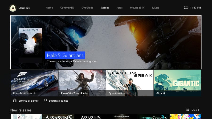
So here's the new experience broom! The update is just over 1GB and takes around 10-15 minutes to apply itself after the download, but after that we move from the land of clutter to the land of slightly better-presented clutter. I was instantly disappointed because, if the 360's New Xbox Experience was a triumphant re-invention, this is more like the same old thing with a lick of paint.
The new UI makes the radical move from five categories to four and a sidebar: there's Home, Community, One Guide, and the Store. There are still tabs everywhere – 25 across the first three, and even more when you select Store and it splits into four categories (Games, Apps, Movies & TV, and Music.) It's now a little less annoying to move between categories, but navigating up-and-down, across-and-over differently-sized windows in loose columns feels the same as it ever did.
There's too much stuff here, to which Mr Xbox may well say "have you SEEN the PS4?" The PS4's UI has as much or more 'stuff' hidden away than the Xbox One but the difference is huge. The Xbox One's new UI is rooted near the top of the screen: this is where the categories are lined up, from which you dive down into the contents. The PS4's UI is firmly in the centre of the screen and, crucially, the top and the bottom of the screen are empty of functional elements until a game or other software is selected (at which point it fills with a background from that item). The way the screen's real estate is used makes it clear what you're selecting, and it's easy to flick about between options. Most important of all, the clutter is not up-front and always on-screen.

We're talking input aesthetics, the fact that certain types of navigation simply have a better rhythm. Going left-to-right then up-and-down on PS4 feels loose and zippy. Going up on Xbox One, then left-to-right, then down feels clunky. Returning to the root menu bar is fast on PS4, it's always nearby, whereas if you're down in the depths in an Xbox One category you have to tap back up in a monotone.
In recent times I've felt bad for Xbox One, because it just cannot put a foot right – and this is another example of great stuff being overshadowed by the bad. The first and for me most important improvement is that it's easier, quicker, and much more reliable to set up parties. Xbox One had the occasional issue with people being unable to join or dropping out and so on, which were very annoying when they cropped up, so hurrah for the New Xbox One Experience here.
The problem the Xbox One UI has is that it’s not flexible enough across the categories, and the categories themselves are quietly baffling."
Another aspect I love is the pop-out bar from pressing left on the home screen – this has Friends, Party, Messages, Notifications and Settings listed vertically. Some of these were lost in silly places on the old dash and it's great to have them all in one place (and with useful touches, like being able to turn the Kinect mic on/off in the Settings tab.) It's a genuine improvement. At the end of the pop-out bar, like a broken tail, sits the 'Snap' option. Remember this? A killer functionality for the Xbox One, they told us, held back only by the fact it is rarely necessary or useful.
The problem the Xbox One UI has is that it's not flexible enough across the categories, and the categories themselves are quietly baffling. Let's consider all those tabs you have the option to click on. When you select the Shop category, it blooms into four more categories with individual titles picked out and browsing channels to select. See, now that's fine because when I go to use a shop I want to either browse or find something – I want lots of options here and don't mind the navigation.

Now consider how the Community feed is implemented. This is two columns, one with friends' activities and one with top gamerscores, but really it's just one big list of activities. No thought has been put into how to group and present these via algorithm, so it's always uninteresting because the top results are all from the last mate who was on. There's no filter on them – you see all screenshots taken and achievements gained.
Community's notifications could easily be nested in sessions (e.g. "John-117 unlocked 'War Never Changes' and seven other achievements") but instead it's just an enormous top-to-bottom list of every single thing your mates do in chronological order. A quarter of the Xbox One's category space is dedicated to this endless, boring list. Microsoft might have ambitions for Xbox One as a social experience but it's hard to see how you could make a less ambitious hub than this.
So the Xbox One's UI works well for the Shop but ends up producing nothing more than a list for Community, and perhaps that speaks volumes about priorities. In terms of the Categories themselves, if someone can give me a valid distinction between the One Guide and the Shop I'm all ears – it's just another storefront. Despite this the ads stay on the homepage, because of course they do, with three in total (for me it was Fallout 4, Halo 5 and Xbox Gold). I regard people who spell Microsoft 'Micro$oft' as bores, on the whole, but even a stopped clock etcetera. It's just not pleasant having buying options pushed on you constantly – especially when you're playing Halo 5 and it's serving up ads for the game saying DOWNLOAD TODAY (it does actually take a day)..

"The Xbox One's UI works well for the Shop but ends up producing nothing more than a list for Community, and perhaps that speaks volumes about priorities."
The truth is that this new UI has four categories when it should have two: Home & Community should be integrated, because the only reason they're not is those front-page ads, and the One Guide is just an extension of the Shop. This would create new problems, of course, but at least it makes some sense.
Always bear one thing in mind when thinking about Xbox One, and how Microsoft change it: this is a machine designed under the assumption it would be a market-leader, big enough to make people play by Microsoft's rules. But it's ended up second in a two-horse race that isn't close.
The Xbox One is slowly adapting to this and, ironically enough, that may just suit it. Microsoft is still relatively new to consoles: the 360 was a breakthrough moment but, as with Sony and PS3, it bred the arrogance that led to Xbox One's original incarnation.
Xbox One now is in a worse situation than PS3, but the situation is similar. Sony recovered from their bad start with (among other things) price cuts and a popular slim model, and the RROD certainly didn't hurt. The Xbox One is on this same long and hard road back. It's not like anyone buys a console for the UI but, that said, it can still tell you a lot about the machine. The New Xbox One Experience is saying "I'm slowly getting better." But perhaps what it should have done was shout from the rooftops "I've changed!"