War's new face - Epic explains Gears 3's cover art

Epic's art director and Gears of War 3’s exec producer give VG247 the thinking behind the visual ID of the biggest Xbox 360 game of 2011.

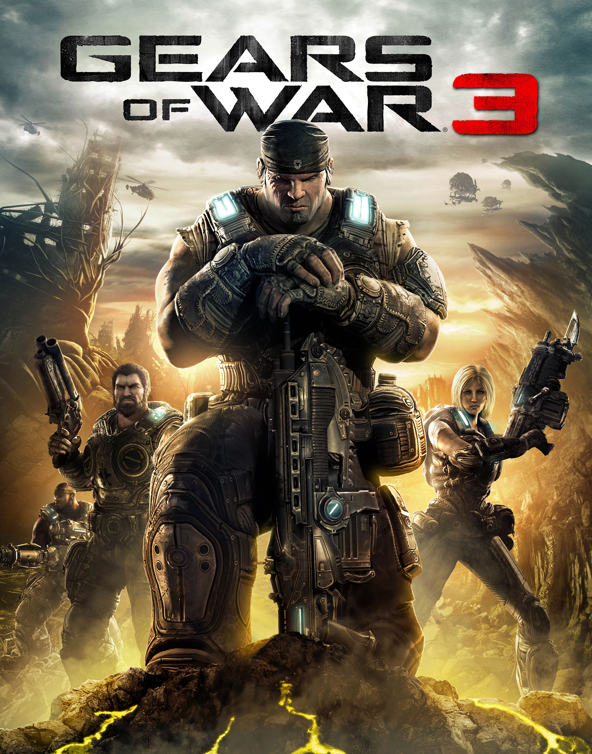
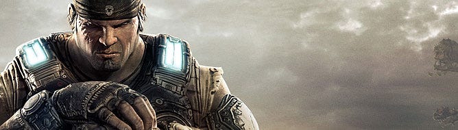
Gears of War 3's cover art, featuring Marcus
kneeling in the foreground, both the
chainsaw and Pendulum War Lancers, Anya
and Dom. The game ships worldwide on
September 20.
Few games will ever enjoy the sheer indulgence of truly making an event of the reveal of its cover art. Only an icon, a franchise great, could withstand accusations of hubris at the idea. Gears of War 3 is one of a tiny handful that could ever manage it.
After confirming a global release date for the game yesterday, Microsoft today unveiled Gears 3's signature image at a San Francisco press event, stating in all but words that you're looking at Xbox 360's core in 2011.
The art features Marcus, kneeling as he was on the cover of the first game, flanked by Dom and the now-playable Anya. This image depicts the Gears end-game, and the wrapping-up of a trilogy that's as intrinsic to Xbox 360 as it is to action gaming history in its entirety.
Epic art director Chris Perna is behind the picture's design, and, speaking on the phone, tells VG247 that the concept of grit through despair drove the final composition.
“I think we wanted something that plays to the world a little bit,” Perna says. “It’s further along in the story, and we wanted to try to get some sadness in there, but still have that determination. They’ve been through a lot, especially now that this is the trilogy wrap-up, and we wanted to show the weariness of the characters, to show it on their faces, but not to make them look sad or sorrowful or wimpy. We wanted to keep that resolution.”

Marcus has lost his full armour in the third
game, but retained the trademark circular
breastplates.
Perna’s aware that the image is still very much in keeping with the franchise, but hopes fans will see something fresh.
“I think we've brought a more modern look to the game,” he says. “We've purposefully reversed the logo text so it's black on a lighter background to give a more modern, updated feel to the franchise.
“We've kept the colour scheme similar with some warm colours, but we've added some cool with the sky. And it's not the same amber as in the previous two. I think if you line them up it still fits in that same family, but it's different enough to make it feel fresh and new. That's what we're hoping for.
“I think the imagery is iconic and it'll pop off the shelves.”
If tweaking colours and swapping logo shades don’t sound like seismic shifts, that’s because they’re not. When you’re moving onto the visual identity of the third instalment of one of the biggest franchises in entertainment as a whole, reinventing wheels isn’t advisable.
“It has to fit within the brand,” says Gears 3 executive producer Rod Fergusson.
“When you have a brand it has to be brand-recognisable, and people have to be able to see what it is, but at the same time it has to be different enough and interesting.”
Fergusson explains that Marcus’s crouched pose in the cover art is a lesson learned from the Gears 1 key art. Having the COG in a kneeling position allows a detailed character to fill the frame and permits large logo type. Crouching is apparently good if you want to sell videogames.
Girl power
It's not just colour-nudging and letter changes that mark Gears 3's cover from the rest of the series. See that person on the right there? That's Anya, the pen-pusher from Gears 2. She doesn't look so neat now, does she?
Gears of War 3 contains playable women for the first time. Samantha Byrne, Anya Stroud, and Bernadette Mataki, a character from the Karen Traviss Gears of War novels, will all be controllable in the game, and, as the art shows, Epic has been careful they're not victims of sexual stereotyping.
"The women in the previous titles have been helpers," Perna says.
"In the third installment we’ve brought them to the forefront. They’re on the frontlines with men. We don’t want centrefold models out there, so we tried to rough them up a little bit, put them in armour and portray them as tough, independent women."
Fergusson concurs.
"We were trying to go for equality, because whatever a male soldier can do or have done to them, a female soldier can experience the same: she can chainsaw Locusts in half, and she can get chainsawed in half. It was all about equality and treating them as equals."
“I think the imagery is iconic and it'll pop off the shelves.”
Anya’s no pushover, and she’s got the weapon to prove it. The rifle she’s holding in the image is a Pendulum War era Lancer, or the Retro Lancer and Epic tags it, a fixed bayonet precursor to the chainsaw classic so closely associated with Gears of War as a franchise.
The Retro Lancer, as per the game’s back-story, comes from an era when human fought human. The fixed bayonet was abandoned because it was prone to shattering on Locust skin.
“The chainsaw bayonet was developed specifically to get through the Locust's thick hide,” says Rod. “It represents an evolution away from human-on-human combat.”
The Retro Lancer is a scruffy weapon, patched up and pragmatic, as befits the story.
“We wanted to get a really worn, used, broken feel to it,” says Perna. “Everything they're doing is pieced together. It's not coming out of the military machine any more. They've got boats that are tied together; they've got weapons that are tied together with duct tape. If you look at the detailing of the weapons, everything is self-repaired. They're basically homeless. They're a broken band of brothers out there.”
Pride of place in the art’s weapons stakes is, of course, taken up by the chainsaw Lancer.
Fergusson: “It's something we always focus on as an icon. We always make sure it's visible in our visual identity. From the Gears 1 cover, to Gears 2 and 3, and even in a lot of our marketing materials, we go out of our way to make sure the Lancer is always there.
“It has a real connection to Gears, and I think it's true in the new visualisation as well. Even when we were doing the cover with Gears 2 and we were walking sideways, we made sure the M-rating stuff didn't cover the gun.”
Perna adds that the Lancer’s iconic status was by no means assured during the original Gears of War design phase.

The first game's box art from 2006. The new
cover takes inspiration from the kneeling
pose.
“We all kind of thought it was goofy,” he says. “We tried different designs. There was a circular saw, a turkey cutter-type thing, and we were like, 'There's no way this is going to work.' Once we landed on the final design, though, it was just 'there'. We knew that was it and that was how it was staying. We knew it was going to be iconic.”
”Look ma, no face”
Gears of War’s other, irrefutable icon is its protagonist, Marcus Fenix. He’s changed. In the previous two covers, Marcus was wearing full armour. Not any more.
“We’ve tried to imagine what would be under the Gears 1 and 2 armour,” says Chris. “It’s summer. The world is hot, and it’s oppressive. We didn’t want them in stuffy outfits. We wanted a different, iconic look to the characters, but at a glance you still have to recognise them as Gears of War.
“The main part of the Gears of War armour is the circular breastplates; that’s what sets them apart. We had to keep that, but also answer the question of what it looked like underneath. We started with Marcus and gave him a kind of Kevlar vest. Look at the lights; in Gears 1 and 2 they had three stripes, so what does that look like with the housing off? What does that look like underneath, with the raw bulb under there? Under the Kevlar they have leather padding, and stuff like that. That’s where all that’s coming from.”
Marcus has still got his hat. Perna admits, though, that removing it was an option.
“We thought about it, but we wanted to keep that iconography,” he says. “That's him. At a glance you can tell it's Marcus, especially when you play the game. It's his trademark.”
To the left of Fenix in the image is Dom. Dom, as you’ll know if you played through the second game, hasn’t had the best of luck, what with him having to murder his wife in cold blood because she got all the life-juice sucked out of her by the mean old Locust.
“Dom is a broken man,” says Perna, explaining the design direction he took with the character in Gears of War 3.
“He's had to put his wife down. He found her in a terrible state, and it crushed his soul. He's not taking care of himself any more, and we wanted to portray that through his design. He's unshaven, he hasn't slept and he's crusty; a piece of him died with Maria.”
Theory of evolution
The art Epic’s showing today is not a standalone product, but an evolution of design over a giant trilogy, the latest in a rich artistic story that began with the first Gears of War in 2006.

The cover of the second game, released in
2008. The all-important Lancer was
carefully placed to avoid the M-rating
symbol.
The original, clearly born from the Unreal stable of character design, set a new benchmark for space action in general, both in terms of look and polish. Gears has become an Xbox 360 icon, thanks both to its art and its exclusivity.
No previous game in the genre had been so artistically chunky. Gears of War’s solidity was no mistake, Perna says.
“We worked very hard to get that heavy feel. We wanted everything grounded. We didn’t want to go crazy, far sci fi; we wanted a Vietnam-esque sci fi. We wanted to feel the weight of the characters, so we worked hard with animation and the way the characters move and run, and we worked hard with character designs in terms of the armour feeling heavy and grounded and reality-based.
“We put a lot of work into designing characters. The feel of the world all wraps up as being heavy and grounded. That’s what we were going for.”
Gears of War’s character design was heavily influenced by Conan artist Frank Frazetta.
“They’re almost barbarians in space, but not that far,” Perna says of Marcus and team, adding that the characters’ stories soften them away from being ridiculous, despite there enormous muscles.
It wasn’t only character design that immediately set the game apart, however. Gears of War was famous for its adherence to the concept of “destroyed beauty,” an idea of ravaged civilisation that permeated the game so completely its special edition included a book solely dedicated to the matter. Fergusson explains that the notion was an vital building block for Gears of War as a franchise.
“It was part of trying to create a science fiction world that wasn’t made of neon and glass; people had lived there,” he says.
“We were going for marble, statues, pillars: history. People lived there for hundreds of years, and it wasn’t shallow. That weight of the world, with its materials of marble and granite, complimented the weight of the characters. From how much smoke comes off a character when he slams into cover, to characters grunting; it all wove into this desire to create a real place, even though they were unreal men.”
Round two
While Gears of War was distinctive, though, it wasn’t free of criticism. Many complained of a blandness in the colour pallete, and the moaning wasn’t lost on Perna. Gears of War 2 contained a substantially altered look, with a wider variety of environments and a largely underground adventure striking at the heart of the Locust.
“We just wanted to separate it a little bit. I was a little disappointed by the dark and the desaturation of Gears 1, and we wanted to bring some more colour into Gears 2. If you look at it, it’s still dark and gritty, but it’s got a little more colour in it, a little more red and orange.”
Taking a more detailed look at the Locust in the second game threw up a Gothic design, but Perna says it wasn’t intentional. There was no getting away from the barbarians, though. One of Gears 2’s iconic press shots showed one of its new enemies, the Boomer Mauler, worrying a dust cloud with his flail and shield and wearing little but a horned helmet. The picture came straight from Conanville.
“That Boomer with the shield is classic Frazetta, right? That’s the type of style we like, and it just comes through in the final product,” says Perna.
The Locust for the third game have changed again. Since the end of the Gears 2, everyone's favourite chainsaw fodder has become less organised, less civilised. The Stranded Locust have been designed in wrappings, and are living in the badlands in squallor, a far cry from the subterranean grandour of Gears 2. Perna likens them to the Sand People in Star Wars.
This time round there's a second threat. The Lambent Locust have mutated into a third race, and bear more similarity to something designed by Giger than Frazetta. They have exoskeletons and growths. Perna welcomed the break from designing the more structured, humanoid Locust.
"They’re a bit more feral," he says of the new Lambent. "It was really exciting to get that design down, work on the behaviour. We could go more savage with them. It was really fun to work on those."
And while the Locust have got more visually varied, so have the game’s environments. In previously released media, Epic’s shown off US diner-style levels, the likes of which have never been included in a Gears title.
“We just wanted to portray different areas,” says Perna. “In this game we're travelling around a lot more. Gears 1 was set in certain cities, and we wanted an older, European vibe. Some of the cities in Gears 3 will capture a more Spanish influence.
“There's going to be Spanish influenced stuff, and there's Mayan stuff, and some of it's going to be really post apocalyptic, dark and gritty.”
Rod adds: “In Gears 1 you're exploring Ephyra, the capital city, and around it. In Gears 2 you're exploring underground and Jacinto; Gears 3 is much more of a road trip.”
The variety in environments even stretches as far as ship levels in Gears 3. The game begins with action on an aircraft carrier called Raven’s Nest, but Perna assures that these sea-based environments will only bring visual alterations.

The reveal trailer.
“We're not doing a lot of boat-to-boat fighting and we're not changing the gameplay. It's still the Gears of War stop-and-pop-type gameplay, with flank bowls and all that kind of stuff. It provides a nice backdrop, but it doesn't fundamentally change play,” he says.
Gears of War 3 proved today, though, that gameplay isn’t everything. Games can be about an icon, and something as simple - and convoluted - as a picture.
They can also be about plot. And there’s one question that key art could never answer.
"Does Carmine die?" I ask.
The conference line explodes with laughter.
Gears of War 3 releases on September 20 worldwide for Xbox 360.