This UI design mockup for PlayerUnknown's Battlegrounds should be implemented in the game ASAP

Fans of PlayerUnknown's Battlegrounds have taken to improving the game's lacklustre UI with their own inventive designs.
PlayerUnknown's Battlegrounds' user interface is functional, it's very much nothing to write home about, but it gets the job done. There's so much wasted space though and so many things it can do better that one player decided to do something about it.
Reddit user shyne23 is an experience designer who created some very clean, and rich UI mockups for the game and shared them with the rest of the community.
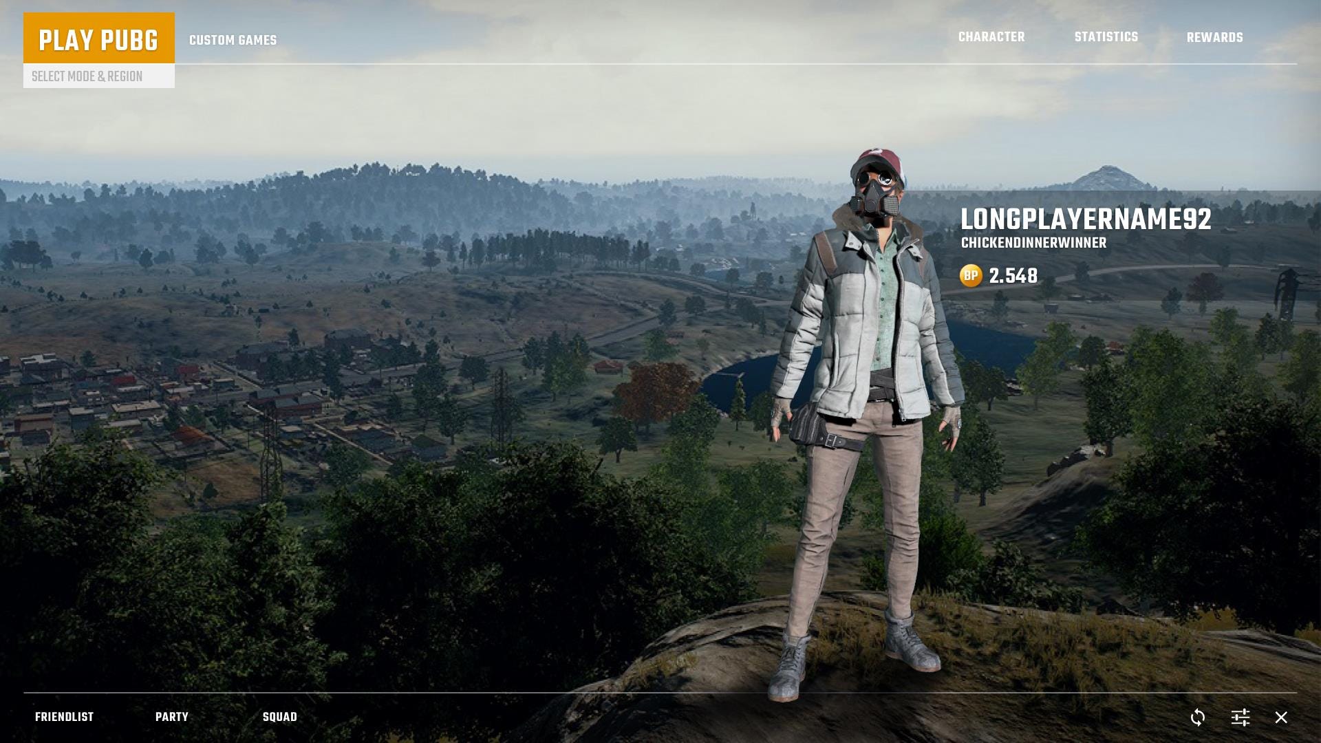
First, we have the start screen, which uses a mix of images and 3D models to make it look good but also responsive enough and easy to load. This screen keeps the same navigation points in the current version, but improves highlighting and font treatment, giving it a more professional look.

As you can see, the play part of the menu also got a facelift, with tabbed menus for the modes, and a dropdown that shows the available servers, traffic, and ping. The friends list is now also more legible, with filters to make it easier to browse.
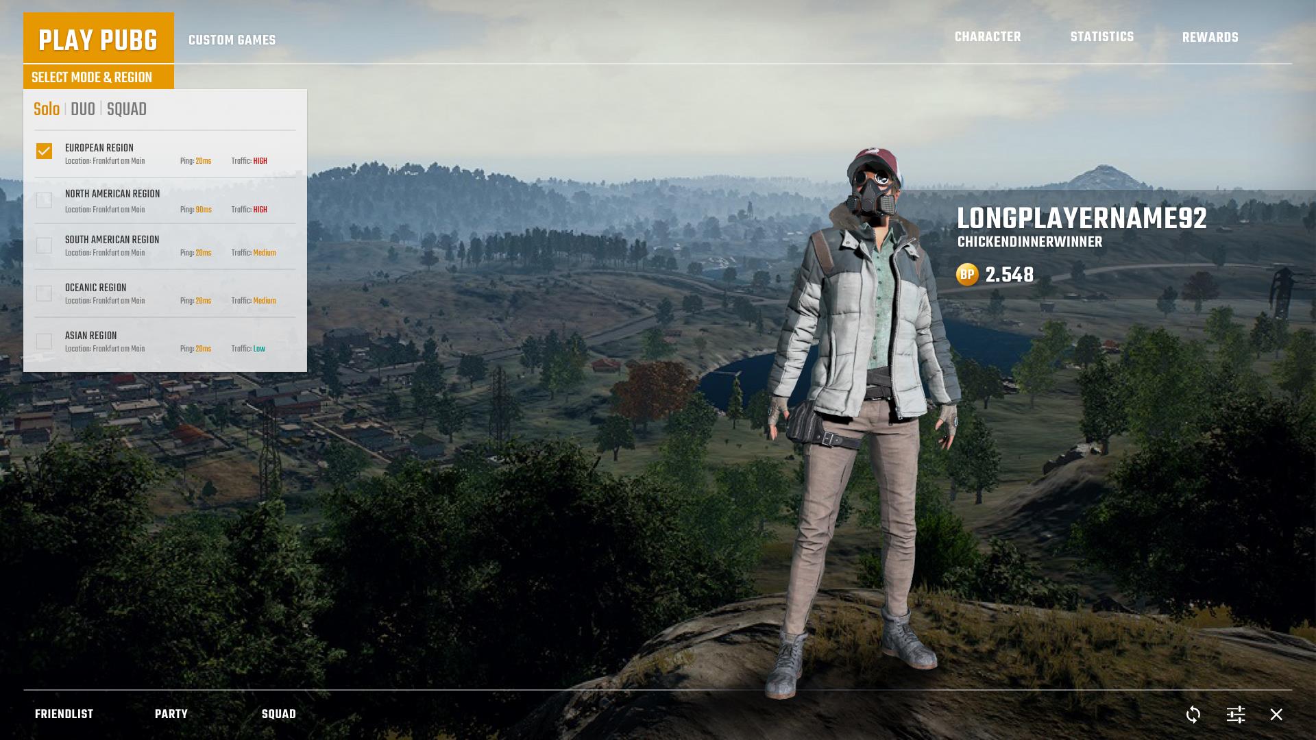

The party section is new, and it allows you to add players from your friends list to it. This also helps in situation where you're invited by someone who isn't on your list.

Of course, the game's UI is not final, and continues to be worked on alongside the game itself in Early Access. Perhaps when the time comes for developer Bluehole to redo the UI, it will take inspiration from this one.