SimCity has 3 colour-blindness modes, developer explains filters

SimCity is a game with many colour-coded UI labels and pointers, so it makes sense that developer Maxis has included three colour-blindness filters in the game. The game's creative and art director Ocean Quigley has created a video demo of the filters at work, and has discussed the features in a new interview.

Speaking with Dtoid, Quigley said, "It's not just a game where you're running down a hallway trying to shoot anything that moves. It's a game where there's always data embedded in the environment -- the environment is a UI. The environment is trying to give you feedback, and if you can't make out the cues because they're color-based, then it's just much harder and less pleasant to play the game."
Quigley then explained that he worked with the studio's QA lead - who is colour-blind himself - to make sure the filters worked properly. "I made a little filter that made it so that I can see what he sees. So I made a filter that emulates what it's like to be red-green color-blind so that you can see the game as somebody who's red-green color-blind, and you couldn't make out a thing! The industrial zones and the residential zones, which are green and yellow, were one in the same.
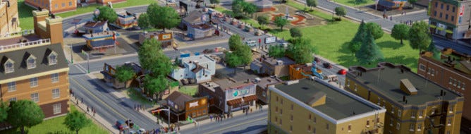
It's a wise move, as the SimCity's Glassbox mode paints the environment with a range of colour cues that depict the happiness of Sims and the desirability of areas. Without these filters the game would almost be unplayable.
Here's Quigley's demo:

What do you make of the mode? Should more games have this feature?